
Master the 160 x 600 ad size: Design & Specs Guide
The 160x600 ad size, better known in the industry as the Wide Skyscraper, is a tall, vertical banner ad that’s become a mainstay in digital advertising. Measuring 160 pixels wide by 600 pixels high, it's specifically designed for maximum impact in website sidebars.
What Exactly is the 160x600 Wide Skyscraper?
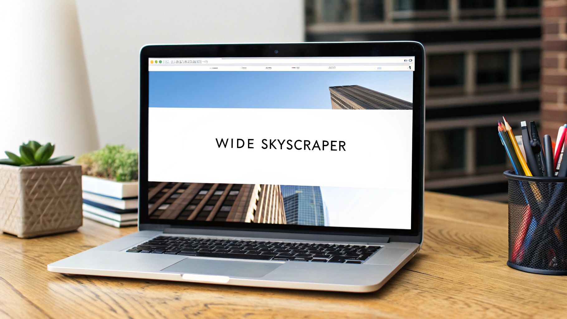
Think of the 160x600 as a slim digital billboard that runs alongside a webpage's main content. You've seen them countless times on blogs, news sites, and forums—they fit perfectly into that vertical space on the right or left.
Its real advantage is its height. As you scroll down to read an article, the Wide Skyscraper often stays in view, keeping the advertiser's message right there in your peripheral vision.
This "sticky" nature is its superpower. While shorter, wider banners scroll out of sight almost immediately, the 160x600 hangs around, making it a fantastic choice for campaigns that need to build brand awareness and keep a message top-of-mind.
Why It's Still a Go-To Ad Format
The 160x600 is a standard ad unit recognized by the Interactive Advertising Bureau (IAB) and was a direct upgrade to the older, skinnier 120x600 skyscraper. That extra width gives designers more breathing room, which translates to more compelling visuals and better engagement from users.
Its vertical layout is tailor-made for sidebars, where it can remain visible as a user scrolls. This directly boosts its viewability metrics and often leads to solid click-through rates. You can find more details on IAB-approved sizes at The Online Advertising Guide.
The Wide Skyscraper has earned its reputation as a reliable workhorse. It's prominent enough to get noticed but doesn't hijack the user's experience, striking a perfect balance between visibility and respect for the reader.
To get a clearer picture, here’s a quick summary of what makes this ad unit tick.
160x600 Wide Skyscraper Ad at a Glance
This table breaks down the core specs and purpose of the 160x600 ad.
This foundation helps explain why the 160x600 ad size is still such a critical tool in a well-rounded display advertising strategy.
Getting the Technical Specs Right

To get your 160x600 Wide Skyscraper live and performing, you first have to nail the technical details. Think of these specs as the non-negotiable rules of the road. Getting them right from the start ensures your ad loads fast, looks sharp, and won't get rejected by ad networks.
The most fundamental rule is the size itself. Your final creative must be precisely 160 pixels wide by 600 pixels tall. No exceptions. Ad networks use automated checks, and if your file is even a single pixel off, it gets kicked back. This isn't just arbitrary pickiness—it's to make sure your ad slots perfectly into a website’s sidebar without disrupting the page layout.
File Types and Weight Limits
Once you've got the dimensions down, you need to think about the file format and its size. Most networks, including the massive Google Display Network, are pretty flexible and accept a few standard types.
- JPG: This is your workhorse for static ads, especially those with rich photography. It gives you a great balance of image quality and small file size.
- PNG: Use this when you need a transparent background or have graphics with sharp lines and solid colors, like a logo.
- GIF: The classic choice for simple, looping animations. It’s limited in its color palette but gets the job done for basic movement.
- HTML5: This is the modern standard for anything complex, interactive, or animated. It gives you far more creative firepower than a simple GIF.
No matter which format you land on, you have to keep an eye on the file size. The industry-standard limit is 150 KB. This is a hard rule designed to protect the user's experience. A heavy ad can slow down a webpage, and a slow page frustrates visitors—which is bad for you and the publisher. A lightweight ad, on the other hand, appears almost instantly.
The 160x600 is a fantastic choice, but it's just one of many. You can see how it stacks up against others in our guide to standard banner ad sizes.
Rules for Animated Ads
If you're going the animated route with a GIF or HTML5 creative, there are a few more guardrails to be aware of. These rules are in place to keep ads from being obnoxious or distracting.
The goal of animation is to draw the eye, not hijack it. Ad networks set limits on duration and looping to ensure a good experience for the user, which ultimately helps your brand avoid causing ad fatigue.
Here are the typical animation standards you'll need to follow:
- Max Duration: Your animation needs to wrap up within 30 seconds.
- Looping: You can have a looping animation, but it must come to a complete stop after that 30-second mark.
- Animation Speed: The frame rate can’t be faster than 5 frames per second (FPS) to avoid that frantic, strobe-like effect.
Designing for High-Resolution Screens
Here’s a pro tip that makes a huge difference: always design for high-resolution displays. Many of today's devices, from laptops to smartphones, have "Retina" screens with a much higher pixel density.
To make sure your ad looks crisp and professional—not blurry or pixelated—on these screens, start by creating your design at double the dimensions: 320 pixels wide by 1200 pixels tall. When you're ready to export, you simply scale it down to the final 160x600 size. This technique packs more detail into the final image, resulting in a much sharper ad that truly stands out.
Strategic Placements on Ad Networks
The 160x600 Wide Skyscraper has a natural home where it performs best: the sidebars of content-heavy websites. We're talking about blogs, news sites, and forums—places where people are settled in, reading and scrolling. This is the sweet spot where the Wide Skyscraper transforms from a simple banner into a serious marketing asset.
Its tall, slender shape is its secret weapon. As a user scrolls down a page, smaller, wider ads quickly disappear from view. But the 160x600 often stays put, holding its ground in the reader's peripheral vision right alongside the main content. This persistent visibility is fantastic for brand awareness, as it subtly reinforces your message without being disruptive.
Where the 160x600 Shines
The Google Display Network (GDN) is, without a doubt, the primary playground for the 160x600 ad. GDN's massive inventory, spanning millions of websites, is tailor-made for this vertical format, making it easy to find placements on blogs and informational sites where sidebars are a standard feature. To see how it fits into a well-rounded campaign, you can explore our complete breakdown of all Google Display Ad sizes for 2024.
Beyond Google, this ad unit is a workhorse in the world of programmatic advertising. If you want to get smarter with your placements, programmatic platforms use real-time data to automatically buy and place your 160x600 ads in the most effective spots. To get a better handle on how it all works, check out this guide on What Is Programmatic Advertising Explained.
The magic of the 160x600 isn't just its size, but its placement. It becomes part of the website's architecture, a consistent companion to the content that keeps a brand visible long after other ads have scrolled away.
The numbers back this up. The 160x600 skyscraper consistently ranks among the most effective ad formats for holding user attention, especially in competitive markets across the US and Europe. It's also recognized as one of the top five most common ad sizes you'll see recommended on platforms like Google Ads, making it a reliable bet for anyone looking for consistent brand exposure.
How to Design Skyscraper Ads That Actually Work

Working with the 160x600 ad size is a whole different ballgame. Its tall, skinny canvas forces you to think vertically and tell a story from top to bottom. A great skyscraper ad doesn't just sit there; it takes the user on a quick journey, turning a glance into a click.
Think of it like a visual elevator pitch. As someone scrolls down a page, you have just a few seconds to grab their attention and make your point. The secret is structuring your design to follow that natural downward reading path.
Build a Clear Visual Path
Visual hierarchy is just a fancy term for putting things in the right order. For a 160x600 ad, this means creating an obvious path for the eye to follow, guiding it straight to your call-to-action.
Top (The Hook): This is your prime real estate. Slap your logo and a punchy headline right at the top. This is what answers the user's first unspoken question: "What is this and who is it from?"
Middle (The Story): Here’s where you flesh out the hook. Use this space for your main product shot, a key benefit, or some eye-catching imagery. This section provides the context and builds interest, but keep it simple—less text is more.
Bottom (The Action): Every good journey has a destination. Your Call-to-Action (CTA) button goes here. Placing it at the end of the visual flow makes clicking it feel like the natural next step for anyone who's still engaged.
A great 160x600 ad doesn't just show information; it directs attention. By controlling the flow from top to bottom, you make your message easier to digest and your call-to-action much harder to resist.
Nailing this top-to-bottom structure is the foundation of any high-performing skyscraper. Get it wrong, and your ad becomes a confusing mess of text and images that people will scroll past without a second thought.
Don't Be Afraid of Whitespace
The narrow 160x600 format can feel a bit claustrophobic, and the temptation is to cram every last pixel with something. Don't do it. Whitespace (or negative space) is your most powerful tool on a vertical canvas.
It gives your text and images room to breathe, cuts down on clutter, and makes everything more readable. A simple, clean layout with one or two clear fonts will always beat a design that’s screaming for attention with clashing colors and tiny, unreadable text. The goal is to communicate, not overwhelm.
Use Animation to Guide, Not Distract
Animation is a fantastic way to make your ad pop, but a little goes a long way. The goal is to gently draw the eye down the ad, not create a seizure-inducing disco party. Use simple, clean animations to introduce elements one by one, reinforcing that top-to-bottom flow.
For instance, you could have your logo fade in first, followed by the headline, then the main image, and finally the CTA. This controlled movement guides the user through your message exactly as intended. There's a reason ad networks cap animations at under 30 seconds—keep it short, sweet, and to the point.
Design Best Practices for 160x600 Ads
To bring all these ideas together, here’s a quick cheat sheet comparing what works with what really, really doesn't.
Stick to these simple rules, and you'll find that the tall, skinny format isn't a limitation—it's an opportunity to create a focused and highly effective ad.
A Practical Guide to A/B Testing Your Ads
Even what you think is a "perfect" ad has room for improvement. Instead of just guessing what your audience wants, A/B testing gives you a straightforward, scientific way to find out for sure and boost the performance of your 160x600 ad size creatives.
At its core, it’s just a head-to-head comparison. You run two versions of an ad—the original "A" version against a slightly different "B" version—to see which one comes out on top. This approach takes the guesswork out of creative strategy. By testing one small change at a time, you can figure out what really grabs your audience's attention and make small, smart tweaks that lead to a much bigger return on your ad spend.
Choosing What to Test First
When you're working with the tall, narrow canvas of a 160x600 ad, some elements naturally carry more weight than others. You'll want to focus your first tests on the big stuff—the changes that are most likely to give you a clear winner without needing a massive amount of traffic.
Here are the best places to start:
- The Headline: It’s the first thing people read, so it has to count. Try pitting a benefit-focused headline ("Save 50% Today") against a pain-point question ("Tired of Slow Software?").
- The Call-to-Action (CTA): The words on your button are your closer. See what happens when you compare direct commands like "Shop Now" against softer invitations like "Learn More."
- Button Color: You'd be surprised how much a simple color swap can impact click-through rates. Test a bold, high-contrast color that really pops against one that’s more on-brand and subtle.
- Primary Image: In a visual format like the wide skyscraper, the main image does all the heavy lifting. Run a test comparing a clean product shot to a lifestyle image that shows your product in a real-world setting.
A/B testing is a process of discovery. Treat every test as a learning opportunity, not just a win-or-lose scenario. The real goal is to gain insights that make every future campaign you run smarter and more effective.
Setting Up a Successful Test
To get data you can actually trust, you need a plan. A messy, unstructured test is worse than no test at all because it can point you in the completely wrong direction. Just follow these simple steps to make sure your results are solid.
- Define Your Goal: First, decide what "winning" looks like. Are you aiming for a higher Click-Through Rate (CTR)? More conversions? Better viewability? Pick one main metric to be your judge.
- Change Only One Variable: This is the golden rule of A/B testing. If you change both the headline and the button color in your "B" version, you’ll have no idea which change was responsible for the results. Isolate one element and one element only.
- Run the Test Long Enough: You need to let the ads run long enough to gather meaningful data. This is often called reaching statistical significance. Most ad platforms, like Google Ads, have built-in tools that will actually tell you when you have a statistically confident winner.
Want to Make 160x600 Ads Faster? Try Automation
Let's be honest, manually cranking out dozens of ad variations for A/B testing is a massive time sink. This is especially true when you're working with a unique format like the 160x600 wide skyscraper. Building each creative one by one just doesn't scale.
This is exactly where tools like Quickads.ai come in. Instead of treating ad creation like an assembly line, you can lean on an AI-powered platform to generate a whole suite of on-brand options in a fraction of the time.
Think of it this way: you provide the strategy and the core ingredients, and the AI handles the repetitive design work. This shifts your team's focus from pixel-pushing to what actually moves the needle—analyzing performance and refining your campaign strategy.
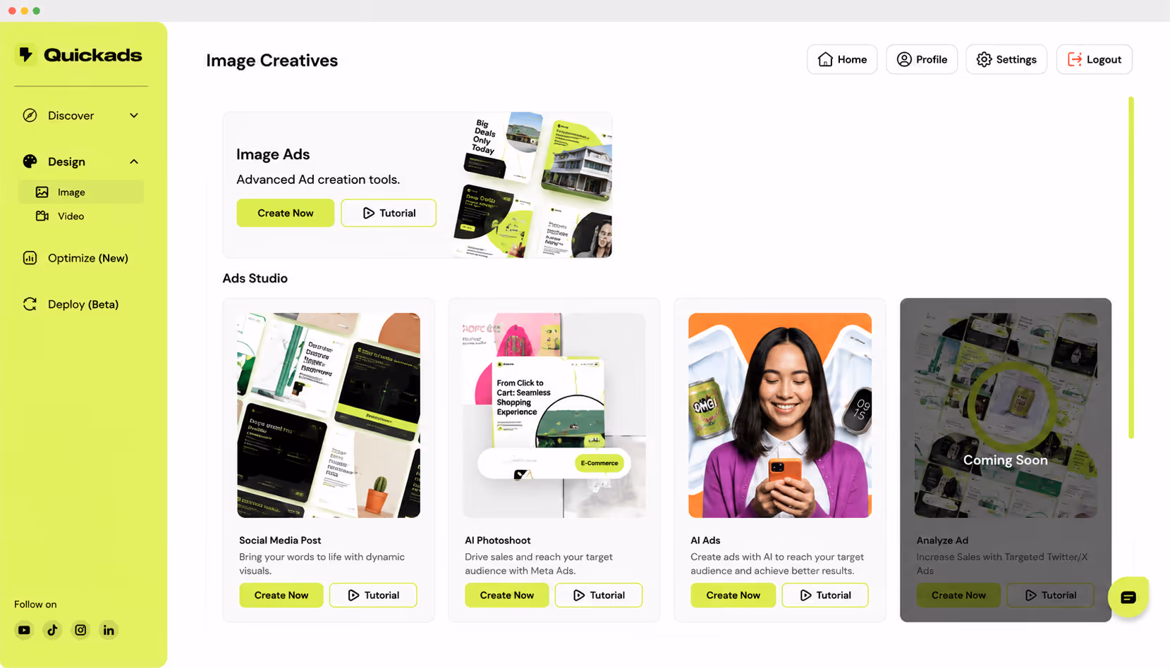
How AI Generation Works in Practice
The whole process is designed to be incredibly simple and efficient. You’re not learning complex software; you’re just feeding the system your core brand assets and letting it do the heavy lifting.
It boils down to a quick three-step workflow:
- Step 1: Upload Your Brand Kit. Start by giving it your logo, key product images, and your brand's color palette.
- Step 2: Add Your Ad Copy. Next, plug in your main headline, body text, and the call-to-action you want to use.
- Step 3: Generate and Review. With a click, the platform will spit out a wide range of 160x600 designs, all ready for you to review and launch.
As you can see, the dashboard is clean and intuitive. You just plug in your brand elements, and the AI takes those components and remixes them into countless professional-looking ads. Every single 160x600 creative is optimized and ready to go.
Automating your 160x600 ad creation isn't just a time-saver. It's about building a scalable system for constant testing and improvement, helping you figure out what your audience actually responds to, faster.
One of the biggest wins here is brand consistency. Every ad variant is generated from the same core assets, so you don't have to worry about off-brand designs accidentally making their way into your campaigns.
If you're interested in how this fits into the broader campaign workflow, it's worth checking out other Automated Ad Launching Tools as well. Embracing automation for creative production can turn a major bottleneck into a real strategic advantage.
Got Questions? We've Got Answers
Even with all the specs laid out, you're bound to have some questions about making the 160x600 ad size work for you. Let's tackle some of the most common ones to clear things up and help you avoid any rookie mistakes.
Is the 160x600 Really a Top Performer?
Yes, but it's all about how you use it. Think of the 160x600 Wide Skyscraper as a strategic player, not a loud one. Its real power lies in brand awareness campaigns. Because it sits in the sidebar, it stays on screen longer as users scroll down the page, giving your brand sustained visibility.
Sure, a massive unit like the 300x600 half-page might feel splashier, but the 160x600 offers a consistent, noticeable presence without getting in the user's way. It's a reliable workhorse for keeping your brand front and center.
Can I Run This Ad on Mobile?
Please don't. The 160x600 is built for the wide-open spaces of desktop and laptop screens, where it fits perfectly into sidebars. Squeezing it onto a narrow mobile screen is a recipe for disaster—it'll either look distorted, push content off the page, or just flat-out annoy the user.
When you're targeting mobile users, you need to use mobile-native formats. The 320x50 mobile leaderboard or the classic 300x250 medium rectangle are your go-to options. They're designed to fit right into the mobile experience, not fight against it.
What's the Number One Mistake People Make With This Ad?
Trying to do too much with too little space. It's the most common trap. Marketers see the vertical height and think they can cram in a whole story, complete with tiny text, multiple images, and a complex logo. The result? A cluttered, unreadable mess that users instinctively ignore.
To sidestep this common blunder, think clean and simple. A winning 160x600 ad size always has:
- One simple message with a headline you can read in a blink.
- Big, legible text. If you have to squint, it's too small.
- A strong visual element that guides the eye down the ad.
- A clear, clickable call-to-action right at the bottom.
When you keep your design focused, your ad can deliver its message in the split second it has a user's attention. That’s what makes it work.
Ready to create stunning, on-brand 160x600 ads without the headache? Let Quickads.ai handle the design work. Our AI platform can generate dozens of optimized creatives for you in seconds, making A/B testing a breeze and saving you a ton of time. Get started for free at Quickads.ai and see for yourself.


Privacy is important to us, so you have the option of disabling certain types of storage that may not be necessary for the basic functioning of the website. Blocking categories may impact your experience on the website. View Our Privacy Policy


