
banner ad sizes standard: 10 essential formats for 2025
In digital advertising, success isn't just about compelling copy or stunning visuals—it's about fitting perfectly into the digital canvas. Choosing the right banner ad dimensions is a critical first step that directly impacts visibility, click-through rates, and ultimately, your campaign's ROI. With dozens of potential sizes across countless platforms, knowing the banner ad sizes standard is essential for efficiency and effectiveness.
This guide cuts through the noise. It provides a definitive roundup of the most important ad dimensions you need to master for maximum impact. We will dive deep into the top 10 formats, exploring not just their pixel dimensions but their strategic purpose, performance benchmarks, and pro-level design tips. Mastering these specifications is a core component of broader ad creative best practices, ensuring your visuals are delivered as intended, without distortion or cropping.
Whether you're a designer crafting the creative, a marketer planning a campaign, or an ad ops specialist ensuring flawless execution, this comprehensive breakdown will equip you with the knowledge to make every pixel count. We'll cover everything from the ubiquitous Medium Rectangle to the expansive Billboard, giving you the practical details needed to build high-performing display campaigns across the web. Forget the guesswork; this is your go-to resource for optimizing ad delivery and performance through precise, standardized creative.
1. Leaderboard - 728x90 pixels
The Leaderboard (728x90 pixels) is a cornerstone of the banner ad sizes standard, often referred to as the "Super Banner." Its wide, horizontal format has made it a persistent and highly recognizable ad unit across the web. Typically placed "above the fold" at the very top of a webpage, it's one of the first elements a user sees, granting it immediate visibility and high impression counts.
This prominent placement, often adjacent to a site's logo and primary navigation, makes it a premium inventory slot for publishers. For advertisers, its expansive width provides a generous canvas for branding, compelling headlines, and visual storytelling without being overly intrusive. Its universal adoption means it is supported by virtually all major ad networks, including the Google Display Network, simplifying media buying and campaign deployment.
Best Use Cases & Strategic Placement
The Leaderboard excels in campaigns focused on brand awareness and direct response. Its visibility is perfect for introducing a new product, promoting an event, or reinforcing brand messaging.
- Top-of-Page Placement: The classic location. Placing the 728x90 banner at the very top of the page maximizes its viewability and ensures it's seen by nearly every visitor. News sites like The Guardian and major blogs frequently use this placement.
- Mid-Content Placement: On long-form content pages or forums, a Leaderboard can be strategically placed between major sections or posts to re-engage readers as they scroll.
- Forum Signatures: While less common now, forums sometimes allow users to place Leaderboard-sized banners in their signatures, offering a unique community-based advertising opportunity.
Design & Optimization Tips
To make the most of this format, your creative must be sharp and your message direct.
- Embrace Brevity: The horizontal layout demands concise copy. Use a powerful headline and a succinct value proposition to grab attention quickly.
- Clear Call-to-Action (CTA): A visually distinct CTA button is crucial. Use action-oriented text like "Shop Now," "Learn More," or "Get Your Free Trial."
- Mobile Considerations: While 728x90 is a desktop standard, it is not mobile-friendly. Ensure you have a mobile-specific creative, such as the 320x50 Mobile Leaderboard, ready for your campaigns to avoid poor user experience on smaller screens.
2. Medium Rectangle - 300x250 pixels
The Medium Rectangle (300x250 pixels) is arguably the most valuable and highest-performing unit in the entire banner ad sizes standard. Often called the "M-Rec" or "Med Rec," its compact, squarish aspect ratio makes it incredibly versatile. This ad unit seamlessly integrates within content, in sidebars, or at the end of articles without disrupting the user experience, leading to higher engagement rates and ad inventory demand.
Its widespread adoption across the Google Display Network and other major ad exchanges means it commands a massive share of available ad impressions. For advertisers, this translates to unparalleled reach and performance potential. Its balanced dimensions provide ample space for impactful visuals, clear messaging, and a prominent call-to-action, making it a workhorse for both branding and direct-response campaigns.

Best Use Cases & Strategic Placement
The Medium Rectangle's strength lies in its adaptability. It performs exceptionally well when embedded directly within the user's primary focus area.
- In-Content Placement: Inserting a 300x250 ad within the body of an article is a highly effective strategy. As users read, the ad appears alongside relevant text, increasing its contextual relevance and click-through rate. Sites like Bloomberg and Medium frequently use this placement.
- Sidebar Integration: The classic sidebar placement, often "above the fold" on the right or left, remains a powerful option. It guarantees visibility on page load and is ideal for brand awareness. E-commerce sites often place these on product pages to showcase related offers.
- End-of-Article Placement: Placing the ad at the conclusion of an article captures the user's attention right when they are deciding what to do next, making it a prime spot for conversion-focused CTAs.
Design & Optimization Tips
To capitalize on the M-Rec's performance, your creative needs to be concise and visually compelling.
- Prioritize Visuals: The nearly square format is perfect for a strong, high-quality image or a short, looping animation. Make the visual the hero of your ad.
- Keep Copy Minimalist: Lead with a powerful headline, a brief benefit statement, and your CTA. Avoid cluttering the limited space with too much text.
- A/B Test Everything: Due to the high impression volume for this ad size, it is the perfect candidate for A/B testing. Test different images, headlines, CTA button colors, and copy to find what resonates most with your audience.
- Optimize for All Devices: The 300x250 banner works well on both desktop and mobile layouts, making it a crucial component of any cross-device campaign. You can explore more on its role in Google campaigns in this guide to Google Display Ad sizes.
3. Wide Skyscraper - 160x600 pixels
The Wide Skyscraper (160x600 pixels) is a prominent vertical ad unit and a key part of the banner ad sizes standard. As its name suggests, it stands tall on a webpage, typically anchored to the left or right sidebar. Its significant height offers a unique canvas for advertisers, allowing for more extensive messaging and visual storytelling than its horizontal counterparts.
This format's value comes from its persistent visibility. As users scroll through content, the skyscraper often remains in view, leading to longer impression times and increased brand recall. Its vertical orientation is particularly effective for showcasing products, displaying detailed information, or running brand narratives that unfold as the user moves down the page. It is a premium ad slot favored by publishers with content-heavy layouts like online magazines and traditional blogs.
Best Use Cases & Strategic Placement
The Wide Skyscraper is ideal for campaigns that benefit from extended exposure and more complex messaging, such as branding, lead generation, and product showcases.
- Sidebar Anchoring: The most common placement is within the fixed sidebars of a website. This ensures the ad stays visible as users scroll, making it perfect for news sites, e-commerce category pages, and detailed blog posts where it can run alongside the main content.
- Content-Heavy Websites: On websites with a lot of text or multiple articles on one page, the 160x600 format provides a constant brand presence without interrupting the flow of information. It acts as a visual anchor in a sea of text.
- Publisher Premium Placements: Due to its high impact and visibility, publishers often sell this ad unit as a premium or exclusive placement, guaranteeing advertisers a dominant position on the page.
Design & Optimization Tips
To maximize the potential of this tall format, designers must think vertically and guide the user's eye downward.
- Segment Content Vertically: Leverage the height by structuring your creative with a clear visual hierarchy. Use the top portion for an attention-grabbing image or headline, the middle for key benefits or details, and the bottom for a compelling call-to-action.
- Strategic CTA Placement: While a single CTA at the bottom is standard, the 160x600's height allows for testing multiple CTAs. You could place one near the top and another at the bottom to capture users at different points of engagement.
- Consider Mobile Responsiveness: The 160x600 is a desktop-first ad size and does not translate well to mobile screens. For comprehensive campaigns, ensure you have mobile-friendly alternatives like the 300x250 Medium Rectangle or 320x50 Mobile Leaderboard to serve on smaller devices.
4. Half Page - 300x600 pixels
The Half Page (300x600 pixels) is a large, high-impact ad unit that commands significant screen real estate. As one of the fastest-growing formats within the banner ad sizes standard, its substantial vertical canvas offers advertisers a powerful platform for rich storytelling and immersive brand experiences. Its size ensures high viewability, often remaining on-screen as users scroll.

This premium format is favored by brands with high-quality creative assets and is typically found on top-tier publisher sites. Its dimensions are ideal for incorporating video, interactive elements, or detailed product showcases without overwhelming the user. For publishers, the 300x600 slot represents a high-value inventory item, often fetching a higher CPM due to its strong performance and engagement metrics.
Best Use Cases & Strategic Placement
The Half Page is best suited for campaigns where brand impact and user engagement are the primary goals, making it a favorite for automotive, luxury goods, and entertainment industries.
- Sidebar Placement: The most common placement is within the sidebar, alongside primary content. On sites like The Wall Street Journal or high-end lifestyle blogs, it provides a persistent brand presence as the user reads an article.
- Sticky or "Anchor" Ads: A popular strategy is to make the Half Page ad "sticky," meaning it fixes to the side of the screen and remains visible as the user scrolls down the page. This dramatically increases time-in-view and engagement potential.
- Content Integration: Placing the 300x600 within the flow of an article, particularly on a wide layout, can create a visually engaging break in the content and capture user attention effectively.
Design & Optimization Tips
The large canvas of the Half Page ad requires a thoughtful and strategic creative approach to maximize its potential.
- Utilize the Vertical Space: Design with a top-to-bottom flow. Guide the user's eye downward with a clear visual hierarchy, starting with a compelling headline or image, followed by supporting details, and ending with a strong call-to-action.
- Incorporate Rich Media: This format is perfect for embedding video, light animations, or interactive elements like a product configurator or a mini-game. These features can significantly boost engagement rates.
- Focus on High-Quality Visuals: Pixelated or low-resolution imagery will be particularly noticeable on a canvas this large. Use crisp, professional photography and graphics to reflect a premium brand identity.
5. Full Banner - 468x60 pixels
The Full Banner (468x60 pixels) is a classic format in the banner ad sizes standard, representing an earlier generation of digital advertising that predates the now-dominant Leaderboard. Its compact horizontal shape offered a less intrusive alternative to larger banners, fitting neatly into website headers and content areas without overwhelming the user experience. While its prevalence has declined in favor of more impactful sizes, it remains a recognized IAB standard.
This format's legacy means it still appears on older publisher websites, industry-specific portals, and forums that have not updated their ad inventory specifications. For advertisers, its smaller size presents a creative challenge, demanding a direct and highly focused message. However, its continued existence on some platforms means it can offer a cost-effective way to reach niche audiences where more modern ad units are unavailable.
Best Use Cases & Strategic Placement
The Full Banner is best reserved for campaigns targeting specific, sometimes legacy, web properties or when budget constraints necessitate using more affordable, lower-demand inventory. Its strength lies in its simplicity and unobtrusiveness.
- Legacy Website Headers: On older websites or forums, the 468x60 is often the primary top-of-page ad unit. Placing it here ensures visibility with an established user base accustomed to this format.
- Industry-Specific Portals: Niche B2B or professional websites that have maintained their original site structure for years may only support the Full Banner, making it essential for reaching that specific audience.
- In-Content on Forums: It can be effectively placed between forum posts or within user signatures, serving as a subtle promotional tool in a community-driven environment.
Design & Optimization Tips
Maximizing the impact of the Full Banner’s limited real estate requires efficiency and clarity in your design and messaging.
- Prioritize a Single Message: With minimal space, focus on one core value proposition or call-to-action. Avoid cluttering the banner with too much text or multiple images.
- Use High-Contrast Design: Make sure your text and CTA button stand out against the background. Bold colors and clear, legible fonts are essential for readability at a smaller scale.
- Consider Subtle Animation: Simple, lightweight animation (like a GIF) can help the 468x60 banner draw the eye and communicate more information than a static image, but be mindful of file size to ensure quick loading on older sites.
- Plan for Modern Alternatives: When building a campaign, treat the Full Banner as a supplemental format. Always have primary creative in modern sizes like 728x90 and 300x250 ready, and only deploy the 468x60 when placement requires it.
6. Mobile Banner - 320x50 pixels
The Mobile Banner (320x50 pixels), often called the "Mobile Leaderboard," is the undisputed champion of mobile web advertising. As internet traffic has decisively shifted to smartphones, this compact ad unit has become an essential part of the banner ad sizes standard. It is specifically engineered for the limited real estate of mobile screens, designed to deliver a message without obstructing the user's primary content.
This banner's small footprint allows it to be anchored to the top or bottom of a mobile webpage, creating a persistent "sticky" ad that remains in view as the user scrolls. This high-viewability placement makes it a powerful tool for generating impressions and maintaining brand presence. Its widespread adoption across the Google Display Network and other mobile ad exchanges ensures massive reach and easy campaign execution, making it a default choice for advertisers aiming to connect with on-the-go audiences.
Best Use Cases & Strategic Placement
The 320x50 banner is most effective for driving brand awareness and high-volume, low-friction conversions on mobile devices. Its strength lies in its ability to be ever-present without being overly disruptive.
- Sticky Bottom-of-Screen Placement: The most common and effective use. Anchoring the banner to the bottom of the viewport on mobile web pages, like those on news sites or blogs, keeps the ad consistently visible as users scroll through content.
- Top-of-Screen Placement: Placing the banner at the very top of a mobile app or webpage ensures it's the first ad a user sees, ideal for immediate brand impact. This is often seen on mobile search result pages or weather apps.
- In-App Content Breaks: Within mobile apps, this banner can be placed between feed items or content listings to catch the user’s eye as they navigate the application's interface.
Design & Optimization Tips
Success with the 320x50 format hinges on creating a visually clear and instantly understandable creative.
- Maximize Contrast: Use bold, high-contrast colors and simple graphics to stand out on a small screen. Ensure text is legible and not cluttered.
- Minimalist Copy: Space is at a premium. Use a short, punchy headline or offer and avoid trying to communicate too much information.
- Optimize Touch Targets: The Call-to-Action (CTA) button must be large enough to be easily tapped with a thumb without accidental clicks. A clear, tappable CTA is non-negotiable for performance.
- Test on Real Devices: Do not rely solely on browser emulation. Preview your ads on actual iOS and Android devices to verify that visuals render correctly and text is perfectly readable.
7. Vertical Rectangle - 240x400 pixels
The Vertical Rectangle (240x400 pixels) is a uniquely proportioned ad unit that stands out in the banner ad sizes standard. Taller and narrower than many common rectangles but not as imposing as a full skyscraper, it occupies a strategic middle ground. This format is often favored by premium publishers and specialized networks for its ability to fit elegantly into content-rich sidebars without dominating the page.
Its distinct vertical orientation provides a compelling canvas for advertisers looking to showcase products or build a narrative sequence. The 240x400 format offers more vertical real estate than a medium rectangle, allowing for more detailed imagery and copy. This makes it a preferred choice for high-end content sites and industry-specific portals where aesthetics and brand messaging are paramount.
Best Use Cases & Strategic Placement
The Vertical Rectangle is most effective in campaigns where visual storytelling and brand prestige are key. Its dimensions are ideal for showcasing fashion, luxury goods, or detailed product shots where a vertical perspective is beneficial.
- Premium Sidebar Placements: This is the most common and effective location. On high-end blogs or curated content sites, the 240x400 ad can appear alongside related articles, offering a non-disruptive yet impactful brand presence.
- Industry-Specific Portals: Niche websites and professional portals often use this size in their sidebars to feature relevant industry services or products, reaching a highly targeted audience.
- Integrated Content Feeds: It can be integrated within grid-based layouts or feeds, blending with editorial content while still being clearly identifiable as an advertisement.
Design & Optimization Tips
To leverage this format's unique shape, designers must think vertically and prioritize visual hierarchy.
- Embrace Vertical Storytelling: Design the creative to guide the user's eye downward. Place the most important element, like a brand logo or key product, at the top, followed by supporting text, and concluding with a strong call-to-action at the bottom.
- Use High-Quality Vertical Imagery: The format is perfect for portrait-oriented photography or graphics. Low-resolution images will be particularly noticeable in this taller format, so always use crisp, high-quality assets.
- Ensure a Clear Hierarchy: With the limited width, it is crucial to establish a clear visual flow. Use a bold headline, concise body copy, and a visually distinct CTA button to prevent the ad from feeling cluttered or difficult to read.
8. Large Rectangle - 336x280 pixels
The Large Rectangle (336x280 pixels) is a high-impact ad unit and a direct, larger alternative to the common 300x250 format. It maintains a similar aspect ratio but provides significantly more screen real estate, making it a premium choice within the banner ad sizes standard. This size is favored by publishers with high-engagement content as it commands more attention without disrupting the user experience.
Often embedded within article content or placed prominently in sidebars, the 336x280 format offers advertisers a larger canvas for more detailed messaging, richer imagery, or even interactive elements. Its increased size often correlates with higher click-through rates and better brand recall compared to its smaller counterpart, making it a staple for advertisers willing to invest in premium inventory for maximum visibility. It's especially effective on platforms where users are already engaged, like YouTube's partner content placements.
Best Use Cases & Strategic Placement
The Large Rectangle is ideal for campaigns aiming for both strong brand presence and direct user action. Its size supports more complex creative and storytelling.
- Premium Content Integration: Placing this ad within high-quality editorial content on news sites or popular blogs ensures it's seen by an engaged audience. It integrates well without feeling overly intrusive.
- End-of-Article Placement: Siting the 336x280 at the conclusion of an article captures the user's attention right after they've finished consuming content, a moment when they are deciding what to do next.
- Sidebar Anchor: As a top-of-sidebar ad, it acts as a strong visual anchor, remaining in view as users scroll through main content on desktop layouts.
Design & Optimization Tips
To capitalize on its larger dimensions, your design should be both visually compelling and strategically sound.
- Leverage the Extra Space: Use the additional pixels for secondary messaging, a compelling product shot, or customer testimonials. Don’t just scale up a 300x250 design; redesign to use the space effectively.
- Test Against the 300x250: Run A/B tests to compare the performance of the 336x280 against the 300x250. The Large Rectangle often performs better, but testing will confirm if the premium cost delivers a worthwhile ROI for your specific campaign.
- Embed Rich Media: This format is an excellent candidate for embedding short video clips or light interactive elements. This can dramatically increase engagement and time spent with the ad.
9. Billboard - 970x250 pixels
The Billboard (970x250 pixels) is a premium, high-impact ad unit within the banner ad sizes standard, often seen as an evolution of the traditional Leaderboard. Its expansive width and generous height create a commanding presence at the top of a webpage, offering a canvas that is perfect for immersive brand storytelling and high-visibility campaigns.
This format is almost exclusively placed "above the fold" on major publisher sites, acting as a powerful welcome mat for visitors. For advertisers, its size is ideal for featuring high-resolution imagery, detailed product visuals, or even lightweight interactive elements. Its premium nature means it often comes at a higher cost, but it delivers unparalleled visibility and brand impact, making it a favorite for product launches and major brand awareness initiatives.

Best Use Cases & Strategic Placement
The Billboard is tailor-made for high-budget, brand-focused campaigns where making a strong first impression is the primary goal. It commands attention and sets a premium tone for the brand message.
- Homepage Takeovers: This ad size is a key component of homepage takeovers on major news and entertainment sites like ESPN or The New York Times, where brands can dominate the visual landscape for a day.
- Product Launches: When launching a new car, smartphone, or luxury item, the 970x250 format provides the space needed to showcase the product with stunning visuals and minimal, impactful text.
- Event Promotions: It's an excellent choice for promoting major films, concerts, or sporting events, using the wide canvas to create a cinematic or exciting visual experience.
Design & Optimization Tips
Given its size and premium cost, optimizing the Billboard creative is critical to achieving a positive return on investment.
- Utilize the Full Canvas: Design with high-quality, compelling visuals that stretch across the entire width. Avoid empty space and use the format's dimensions to your creative advantage.
- Prioritize Fast Loading: A large ad can slow down page load times, leading to higher bounce rates. Compress images and optimize file sizes meticulously to ensure the ad loads instantly without disrupting the user experience.
- Keep Branding Prominent: The Billboard is a brand awareness powerhouse. Ensure your logo and key brand message are clearly visible but elegantly integrated into the overall design. To dive deeper into optimizing this format, you can learn more about 970x250 ad size best practices on QuickAds.ai.
- Plan for Mobile: The 970x250 format is strictly for desktop. A corresponding mobile strategy using sizes like the 320x100 Large Mobile Banner is essential for reaching users across all devices.
10. Square - 250x250 pixels
The Square (250x250 pixels) is a versatile and compact ad unit that has become an essential part of the banner ad sizes standard. Its perfectly symmetrical shape provides a balanced canvas that integrates seamlessly into a wide variety of website layouts, particularly those with grid-based or modular designs. It's often found embedded within content, in sidebars, or at the end of articles, making it less intrusive than larger banner formats.
This format's balanced proportions are highly effective for displaying both visual and textual information without compromise. For advertisers, the 250x250 Square offers a flexible asset that can be easily repurposed from social media campaigns, especially from platforms like Instagram or Facebook that favor square creatives. Its adaptability ensures it performs well across both desktop and mobile environments, making it a reliable choice for broad-reach campaigns.
Best Use Cases & Strategic Placement
The Square is a workhorse format ideal for campaigns that require flexible placement and consistent branding. It excels in both direct response and brand awareness goals due to its non-disruptive nature.
- Sidebar Integration: A common placement for the 250x250 is within the sidebar of a blog or news site. It can be stacked with other square or rectangular ads to create a dynamic advertising column.
- In-Content Placement: Embedding the Square ad within an article or between product listings on an e-commerce site can capture high user engagement. Pinterest-style grid layouts are a perfect environment for this ad size.
- End-of-Article Summaries: Placing the Square at the conclusion of an article serves as a natural next step for an engaged reader, making it a prime spot for a relevant call-to-action.
Design & Optimization Tips
To maximize the impact of the 250x250 Square, your design must be clean, focused, and easily digestible.
- Establish a Clear Focal Point: The smaller, symmetrical space requires a strong visual hierarchy. Use a compelling image or a bold headline as the primary focus to instantly draw the eye.
- Repurpose Social Creatives: Leverage your existing square assets from social media. This not only saves design time but also creates a consistent brand experience for users who see your ads across multiple channels.
- Keep Text Legible: Ensure that any text is large enough to be easily read, even when the ad is viewed on smaller screens. Avoid cluttering the limited space with too much information; prioritize a single, clear message.
Top 10 Standard Banner Ad Sizes
From Pixels to Profit: Activating Your Ad Size Strategy
Navigating the landscape of banner ad sizes standard can feel like learning a new language, one spoken in pixels and aspect ratios. Throughout this guide, we've dissected the top 10 most influential ad dimensions, moving beyond mere specifications to uncover the strategic purpose behind each one. From the commanding presence of the 970x250 Billboard to the ubiquitous and high-performing 300x250 Medium Rectangle, each size offers a unique canvas to capture audience attention.
The core lesson is this: ad size is not a technical detail; it is a strategic choice. The formats you select directly influence visibility, engagement, and ultimately, campaign ROI. A 728x90 Leaderboard excels at brand awareness at the top of a page, while a 300x600 Half Page offers a larger, more immersive canvas for storytelling on the sidebar. Failing to align your chosen ad size with your campaign objective is like trying to fit a square peg in a round hole; it's inefficient and rarely yields the desired result.
The Strategic Takeaway: Context is King
Mastering the banner ad sizes standard is fundamentally about understanding context. The most successful advertisers don't just pick a size because it's popular; they choose it because it fits the user experience of the placement.
- Placement Power: Where will the ad appear? A 320x50 Mobile Banner is effective because it’s designed for the limited screen real estate of a smartphone, offering visibility without being overly intrusive.
- Creative Constraints: Does the ad's message fit the format? The narrow, vertical orientation of a 160x600 Wide Skyscraper is ideal for showcasing a tall product or a tiered list of benefits, but it would cripple a landscape-oriented photograph.
- Performance Potential: Which sizes historically perform best for your goals? Data consistently shows that sizes like the 300x250 and 336x280 Large Rectangle often boast higher click-through rates due to their integration within content.
Your strategy should involve creating a versatile suite of the top 3-5 ad sizes that align with the majority of your target inventory. This "core set" ensures you have maximum reach without having to design for every possible dimension.
Bridging Knowledge and Execution
Understanding these principles is the first critical step. The second, and often more challenging step, is implementation. Manually creating, resizing, tweaking, and exporting a dozen variations of a single ad concept is a massive resource drain. It’s a process that consumes valuable design hours, introduces the potential for human error, and creates a significant bottleneck that slows down campaign launches and testing.
This operational drag is precisely where modern technology offers a decisive advantage. The goal is not just to know the rules of banner ad sizes standard, but to build a system that executes them flawlessly and at scale. When your team can generate a full suite of ad creatives in minutes instead of days, you unlock the ability to be more agile, responsive, and data-driven.
Key Insight: The true competitive edge lies not just in knowing the standard ad sizes, but in your ability to produce and deploy optimized creative for them faster than your competition. Efficiency in execution directly translates to more opportunities for testing, learning, and profit.
As you move forward, transform this comprehensive list from a reference guide into an active playbook. Audit your current creative assets. Are you relying too heavily on one or two sizes? Are there untapped opportunities with formats like the Half Page or Billboard? Use this knowledge to build a smarter, more diversified, and ultimately more profitable advertising strategy.
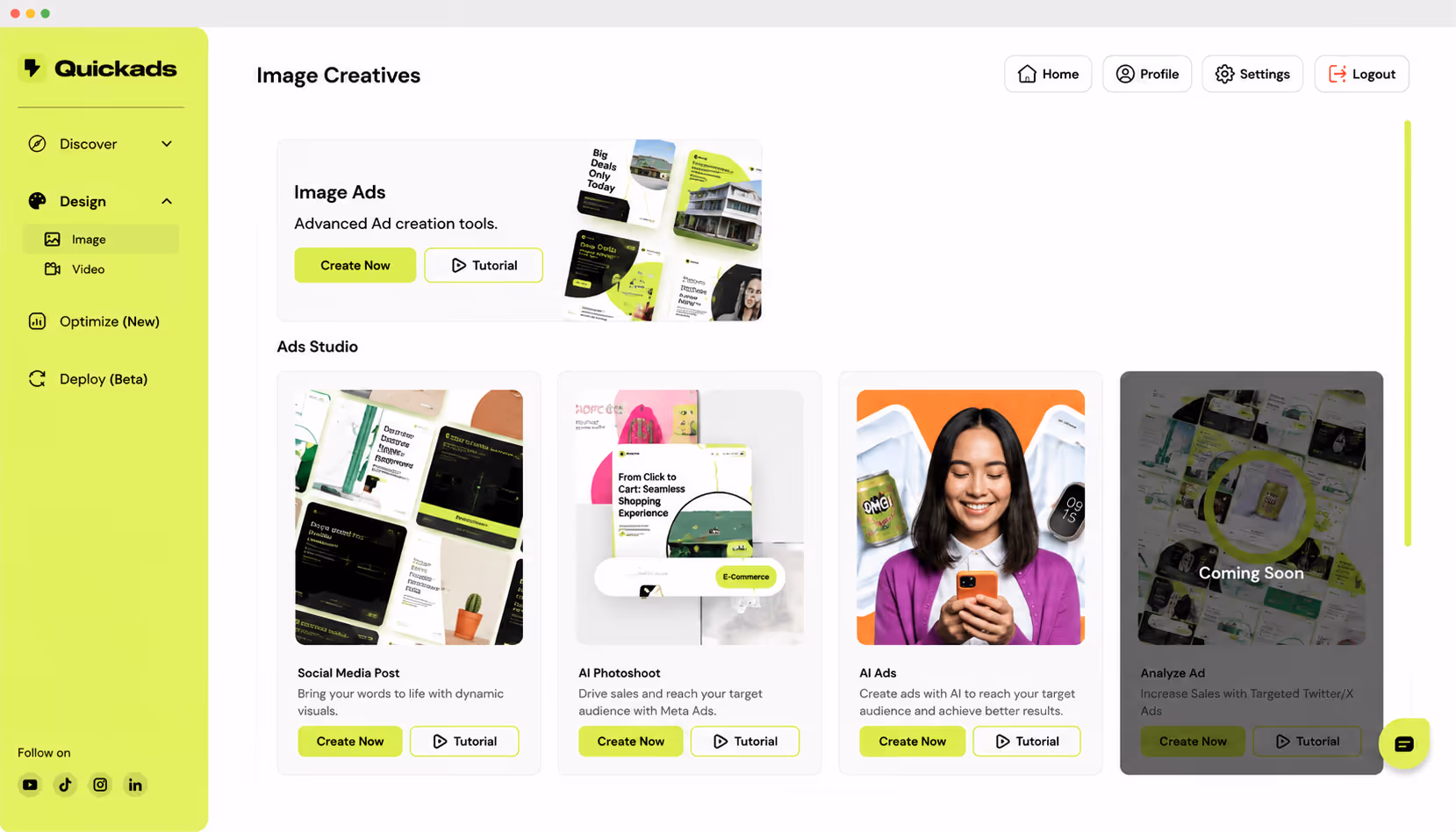
Ready to turn theory into action and eliminate the friction of ad creation? quickads.ai uses the power of AI to instantly generate a complete set of high-performing ads across all banner ad sizes standard. Stop wasting time on manual resizing and start focusing on strategy by visiting quickads.ai to streamline your creative workflow today.


Privacy is important to us, so you have the option of disabling certain types of storage that may not be necessary for the basic functioning of the website. Blocking categories may impact your experience on the website. View Our Privacy Policy


