
How to Turn Mobile App Features Into Ads That Actually Drive Downloads
Mobile app ad creative works best when it sells the user’s next useful moment, not a list of product features.
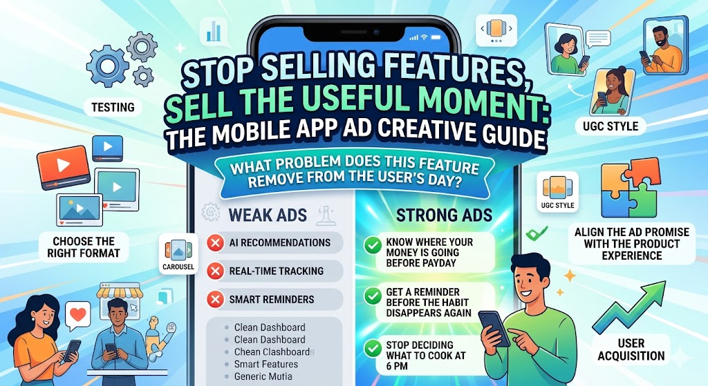
A lot of app campaigns get this wrong. The ad says the app has AI recommendations, real-time tracking, smart reminders, or a clean dashboard. Those details may matter, but they rarely make someone stop scrolling. Users care about what the feature helps them do faster, avoid, understand, or finish.
That is the shift this guide focuses on. You will learn how to turn mobile app features into clearer ad angles, choose the right creative format, align the ad promise with the product experience, and test before spending more on user acquisition. You will learn how a mobile app development company can turn mobile app features into clearer ad angles, choose the right creative format, align the ad promise with the product experience, and test before spending more on user acquisition.
What You’ll Learn
- How to turn app features into user-focused ad messages
- Why feature-heavy ads often underperform
- Which ad formats fit different app features
- How to use onboarding as a creative blueprint
- How to keep ads aligned with the real product experience
- What to test before scaling app install campaigns
- How pricing and billing claims can affect trust
Why Feature-Based App Ads Often Fall Flat
Most app teams are proud of their features. That makes sense. Features take time to design, build, test, and launch.
The problem is that users do not download apps because a team worked hard on them. They download apps because the ad makes a specific problem feel easier to solve.
A weak app ad usually sounds like this:
- “AI-powered financial insights”
- “Real-time fitness tracking”
- “Smart productivity dashboard”
- “Advanced habit reminders”
Those lines are not useless, but they are incomplete. They describe what the app has, not what changes for the user.
A stronger ad connects the feature to a visible outcome:
- “See where your money is going before payday.”
- “Know when your workout consistency starts slipping.”
- “Plan your day without opening five different tools.”
- “Get a reminder before the habit disappears again.”
That difference matters because the app market is crowded. Sensor Tower’s State of Mobile 2025 report found that users spent 4.2 trillion hours in apps in 2024, while consumer spend reached $150 billion. That scale creates opportunity, but it also means users have seen every generic app promise before.
If your ad sounds like every other app in the category, the feature list will not save it.
Start With the User Problem, Not the App Feature
Before writing ad copy, ask one simple question:
What problem does this feature remove from the user’s day?
That question keeps the campaign from turning into a product spec sheet. It also helps non-technical marketers understand what to promote without needing to know every detail behind the build.
Here is a simple way to translate features into ad-ready angles:
App Feature
Weak Ad Angle
Stronger Ad Angle
Budget tracker
Track expenses in real time
See where your money goes before payday
Fitness reminders
Get daily workout alerts
Stop forgetting workouts after week one
AI chatbot
Use a smart assistant
Get answers without waiting for support
Meal planner
Build weekly meal plans
Stop deciding what to cook at 6 PM
Project dashboard
Manage team tasks
Know what is stuck before the deadline slips
The stronger version does not ignore the feature. It explains why the feature matters.
That is usually the best starting point for mobile app marketing. Lead with the pain, then show the feature as the relief.
Match Each Feature to the Right Ad Format
Not every feature belongs in the same type of ad. Some app features need a screenshot. Others need motion. Some need a person explaining the problem before the app appears.
Choosing the format too early can weaken the campaign. Start with the feature’s role, then pick the creative format that makes that role obvious.
Screenshot Ads
Screenshot ads work well when the app interface builds trust quickly.
Use them when:
- The UI is clean and easy to understand
- The feature can be explained in one screen
- The app solves a familiar problem
- Users need to see proof before downloading
For example, a budgeting app might show a clean spending breakdown. A scheduling app might show a simple weekly view. A health app might show progress over time.
The mistake is using screenshots as decoration. A screenshot should answer a question in the user’s mind, not simply prove the app exists.
Short Video Ads
Short video works best when the value appears through motion.
Use video when:
- The app has a simple workflow
- The value appears after a few taps
- The feature solves a before-and-after problem
- The first user action is easy to show visually
A 10-second clip can often explain more than a long headline. For example, show someone scanning a receipt, checking a recommended action, or completing a task that used to take too long.
Keep the video focused. One pain point, one flow, one result.
UGC-Style Ads
UGC-style ads work when the problem is emotional, personal, or relatable.
Use them when:
- The user needs to feel understood
- The category has trust barriers
- The app solves a daily frustration
- The founder or customer voice adds credibility
The best UGC-style app ads rarely start with the app. They start with the moment the user recognizes.
For example:
“I kept downloading budgeting apps and deleting them after three days because they made me feel worse about my money.”
That is a stronger opening than:
“Try our new budgeting app with smart insights.”
Carousel Ads
Carousel ads work well when the app has a sequence of benefits.
Use them when:
- The app solves a multi-step problem
- You need to show several use cases
- The feature set is broad but connected
- You want to turn onboarding into a visual story
A simple structure can work:
- Show the problem
- Show the first useful screen
- Show the action
- Show the result
- End with the download prompt
This format is especially useful when the app is not instantly obvious from one screenshot.
Use the App’s First 30 Seconds as Your Creative Blueprint
The first 30 seconds after download are one of the best sources of ad creative.
That is when the user decides whether the app feels useful, confusing, trustworthy, or forgettable. If your ad promises relief, speed, control, or clarity, the early product experience has to support that promise quickly.
A good creative review should ask:
- What does the user see first?
- What action do they take first?
- How long does it take to reach value?
- Which screen best proves the app works?
- What would make a user say, “Okay, I get it”?
The strongest campaigns usually happen when marketers work with mobile app developers early enough to understand which features are stable, which flows are ready, and which promises the product can actually support.
That coordination protects both sides. Marketing avoids promoting something fragile. Product teams get clearer feedback on what users care about before and after launch.
If your team is still planning the build, AppMakers USA has a useful breakdown of how the mobile app development process works, from validation and prototyping to launch and post-release iteration.
Align the Ad Promise With the Product Experience
A mobile app ad can win the click and still lose the user.
That usually happens when the ad promise and product experience do not match. The ad makes the app feel fast, easy, or personalized, but the user lands in a slow signup flow, unclear onboarding, or a feature that is not actually ready.
This mismatch creates three problems:
- Lower install-to-activation rates
- Higher uninstall rates
- More wasted ad spend
Good app creative should match the real experience users get after downloading.
That means:
- Use real or near-final screens whenever possible
- Avoid promoting features still in testing
- Keep app store screenshots aligned with ad claims
- Make the first-use flow support the advertised promise
- Watch activation and retention, not only clicks
For founders working through launch planning, AppMakers USA’s guide on how to budget your mobile app project is useful because it looks beyond the first build and accounts for post-launch work, updates, maintenance, and growth.
That matters for ad creative because the campaign does not end at the install. The product still has to carry the promise forward.
Test Creative Before You Scale User Acquisition
Creative testing should happen before a team starts spending heavily on user acquisition.
A common mistake is to build one polished campaign, launch it, and assume the market will respond. A better approach is to test smaller creative variations first.
Start with the variables that change user perception the most:
Test the Hook
Compare problem-led and outcome-led openings.
Example:
- Problem-led: “Still forgetting to log expenses?”
- Outcome-led: “Know where your money went before payday.”
Both could work. The right answer depends on the audience.
Test the Visual
Try different visual entry points:
- Real app screen
- User reaction
- Before-and-after comparison
- Simple workflow video
- Founder-style explanation
The goal is not to make the prettiest ad. The goal is to learn which angle makes users understand the app fastest.
Test the CTA
Generic CTAs like “Download now” are not always wrong, but they are not always the strongest option.
Try CTAs that match the user outcome:
- “Plan your week”
- “Track your spending”
- “Start your first workout”
- “Organize today’s tasks”
The CTA should feel like the next action, not a command from the brand.
Test Beyond Clicks
Clicks can be misleading. A dramatic ad may earn attention but bring in the wrong users.
Track:
- Click-through rate
- Install rate
- Signup completion
- First key action
- Trial starts
- Subscription conversion
- Retention after day one, seven, and thirty
Adjust reported that global app installs climbed 10% year over year in 2025 while sessions rose 7%, which points to continued demand. Still, growth teams need to look past installs if they want sustainable acquisition.
An ad that gets fewer clicks but attracts users who activate, subscribe, or return may be the better campaign.
Don’t Forget Pricing, Trials, and Billing Promises
If the app ad mentions a free trial, subscription, usage limit, credit system, or paid plan, pricing becomes part of the creative promise.
That promise needs to be clear.
Users get frustrated when an ad suggests one thing, the app store listing says another, and the checkout flow adds a surprise. This is especially important for SaaS apps, AI tools, productivity apps, fintech products, and any app with usage-based plans.
Before launching pricing-related ads, check:
- Does the ad explain what is free and what is paid?
- Does the app store listing match the same offer?
- Is the trial length clear?
- Are usage limits easy to understand?
- Can the billing system support the promoted plan?
- Can the team adjust pricing without a slow engineering cycle?
For SaaS or app teams experimenting with usage-based plans, subscriptions, or pricing changes, it is worth reviewing billing infrastructure early. Platforms like Zenskar help teams manage usage-based billing, metering, revenue recognition, and pricing changes without forcing every adjustment back through engineering.
That is not just a finance issue. It affects marketing too. If the campaign promotes a flexible plan, the product and billing flow need to deliver that flexibility cleanly.
Mobile App Ad Creative Checklist
Use this checklist before pushing more budget into an app campaign.
Messaging
- Does the ad start with a real user problem?
- Is the feature translated into a clear benefit?
- Can the user understand the value in a few seconds?
- Does the headline avoid vague product language?
Visuals
- Does the visual show the app experience clearly?
- Is the screen readable on mobile?
- Does the creative focus on one main idea?
- Is the format right for the feature being promoted?
Product Alignment
- Is the promoted feature live and stable?
- Does onboarding support the ad promise?
- Does the app store page repeat the same value proposition?
- Are screenshots and claims accurate?
Measurement
- Are you tracking more than clicks?
- Do you know which creative drives activation?
- Are trial starts, subscriptions, and retention being measured?
- Is the team learning from failed creative tests?
Launch Readiness
- Is the app ready for a larger traffic spike?
- Is the pricing or trial flow clear?
- Is the support team ready for user questions?
- Is the campaign aligned with the actual release plan?
If the launch strategy is still being shaped, AppMakers USA’s article on hard launch meaning is a helpful reference for understanding the risks of releasing to a wide audience all at once.
FAQs
What makes a good mobile app ad?
A good mobile app ad connects a clear user problem to a visible product outcome. It does not just name features. It shows why the app is worth downloading and what the user can do after opening it.
Should app ads focus on features or benefits?
Benefits should lead. Features still matter, but they need context. “Real-time tracking” is weaker than “know when your spending is getting out of hand before payday.”
What app screens work best in ads?
The best screens are usually the ones that prove value quickly. Dashboards, progress views, before-and-after screens, simple workflows, and result screens often work better than generic home screens.
How do you test app ad creative before launch?
Test hooks, visuals, CTAs, and formats in small batches before scaling spend. Compare not only click-through rate, but also installs, signups, activation, and retention.
Why do some app ads get clicks but not downloads?
The ad may be attracting curiosity instead of intent. It may also promise something the app store page or onboarding flow does not reinforce. Strong campaigns keep the ad, store page, and first-use experience aligned.
Build Ads Around the Experience Users Actually Get
The best mobile app ads do not come from dressing up a feature list. They come from understanding what users are trying to solve and showing how the app helps them reach that moment faster.
Start with the user problem. Pick the feature that proves the solution. Choose the format that makes the value easy to understand. Then test before spending heavily.
When marketing, product, development, and billing all support the same promise, app ads become easier to trust. That trust is what turns attention into downloads, and downloads into users who actually stick around.


Privacy is important to us, so you have the option of disabling certain types of storage that may not be necessary for the basic functioning of the website. Blocking categories may impact your experience on the website. View Our Privacy Policy


