
Top 10 Common Banner Ad Sizes for 2025: A Complete Guide

In the competitive sphere of digital advertising, success often comes down to the details. While compelling copy and stunning visuals are critical, one of the most fundamental yet frequently overlooked elements is choosing the correct ad dimensions. Selecting the wrong banner size can lead to distorted creatives, rejected ads on major networks like Google Display, and a squandered marketing budget. This comprehensive guide is designed to demystify the complex world of common banner ad sizes, serving as a strategic blueprint for designers, marketers, and business owners alike.
Think of ad specifications not as restrictive rules, but as the foundational canvas for your creativity. The right format ensures your message is delivered exactly as intended, whether it appears on a desktop, mobile device, or tablet. Understanding which sizes perform best on specific platforms and for certain campaign goals is the difference between an ad that gets ignored and one that drives meaningful engagement. For inspiration on how banner ads integrate into broader strategies, explore some of these notable digital marketing campaigns.
In this roundup, we will dive deep into the top-performing formats that every advertiser needs to know. We’ll dissect their specific use cases, explore platform-specific nuances, and provide actionable design tips for each dimension. Our goal is to equip you with the practical knowledge to ensure your ads not only fit the designated space but also command attention, maximize visibility, and deliver tangible results. Let’s get started.
1. Leaderboard (728×90 pixels)
The 728×90 Leaderboard is a cornerstone of digital advertising and one of the most common banner ad sizes you will encounter. Its wide, horizontal layout makes it a prime candidate for placement at the top of a webpage, often just below the main navigation menu. This prominent "above the fold" position guarantees high viewability, capturing user attention immediately upon page load.
Standardized early on by the IAB and heavily promoted through networks like Google AdSense, the Leaderboard's value lies in its balance. It offers a generous horizontal canvas for creative messaging without being overly intrusive to the user's reading experience. Major publishers like The New York Times and CNN frequently use this format at the top of their homepages, establishing it as a premium advertising slot.
When to Use the Leaderboard
This ad size is ideal for campaigns focused on brand awareness and direct response. Its prominent placement ensures your logo and core message are seen, making it perfect for introducing a new product or reinforcing brand identity. The wide format provides ample space for a compelling image, a concise headline, and a clear call-to-action (CTA), driving clicks and conversions effectively.
Actionable Design Tips for the 728×90 Leaderboard
To maximize the impact of this popular format, focus on clarity and immediate visual appeal.
- Structure Your Layout: Divide the banner into three conceptual zones: your brand logo on the left, the core value proposition or offer in the center, and a distinct CTA button on the right. This follows the natural Z-pattern of eye movement.
- Emphasize Readability: Keep text minimal and high-contrast. A short, powerful headline of 5-7 words is far more effective than a cluttered sentence.
- Use Subtle Animation: Animate elements like the CTA button or key text to draw the eye without distracting from the page content. A simple fade-in or a subtle color change can significantly increase engagement.
- Mobile Considerations: While the 728×90 is a desktop standard, ensure your campaign includes responsive variants like the 320×50 mobile banner to maintain visibility on smaller screens.
2. Medium Rectangle (300×250 pixels)
The 300×250 Medium Rectangle, often called an "MREC," is arguably the most valuable and highest-performing of all common banner ad sizes. Its compact, squarish shape provides incredible versatility, allowing it to be seamlessly integrated within website content, such as between paragraphs of an article, or placed prominently in sidebars. This ability to appear "in-content" leads to higher engagement rates as users naturally encounter it while reading.
Its universal adoption and consistent performance have made it a favorite for major ad networks. Google AdSense frequently reports it as a top earner for publishers, and it has long been a standard unit for social platforms and professional publishing networks. You can see this format in action everywhere, from advertisements in the Reddit sidebar to the embedded ad units on major news sites and YouTube.
When to Use the Medium Rectangle
This ad size is a powerful all-rounder, effective for nearly any campaign goal, including brand awareness, lead generation, and direct sales. Its prime placement within content makes it exceptionally good for performance marketing, where capturing attention alongside relevant material is key. The balanced dimensions provide enough space for both compelling visuals and clear messaging without disrupting the user journey.
Actionable Design Tips for the 300×250 Medium Rectangle
To capitalize on this format's high-performance potential, your design must be both eye-catching and harmonious with the surrounding page content.
- Establish a Clear Hierarchy: With limited space, guide the viewer's eye intentionally. Use a dominant image or graphic, a bold and concise headline, and a visually distinct CTA button to create a clear path for the user.
- Leverage White Space: Don't crowd the canvas. Use negative space strategically to make your core message and CTA stand out. A clean, uncluttered design feels more professional and is easier to digest quickly.
- Use High-Contrast Colors: Ensure your ad is visible but not jarring. Use contrasting colors for your CTA button (e.g., an orange button on a blue background) to make it pop and encourage clicks.
- Optimize for Multiple Contexts: This ad appears on desktop, tablet, and mobile sites. Ensure typography is legible and key visuals are clear even when viewed on smaller, high-resolution screens. To see how this size fits within a broader strategy, you can find more details in this guide to Google Display Ad sizes.
3. Wide Skyscraper (300×600 pixels)
The 300×600 Wide Skyscraper, often called a "Half Page" unit, is a high-impact ad format prized for its large vertical canvas. Positioned along the side of a webpage's main content, it offers advertisers significant creative real estate without disrupting the primary user flow. Its size provides the feel of a magazine half-page ad, making it a favorite among brands seeking to make a strong visual statement.
This format gained immense popularity through programmatic advertising platforms and premium publisher networks that recognized its superior performance. Because it's larger and more visually dominant than other sidebar units, it commands higher engagement and click-through rates. You'll often see this size on high-engagement content sites like TechCrunch or the Wall Street Journal, where it effectively captures reader attention alongside detailed articles.
When to Use the Wide Skyscraper
The Wide Skyscraper is exceptionally well-suited for campaigns that require storytelling or showcasing detailed product imagery. Its vertical orientation allows for a narrative flow, guiding the user's eye from top to bottom. This makes it perfect for fashion, automotive, or travel brands that need space to display compelling visuals and multiple value propositions. It is also a top performer for direct response campaigns where a larger, more noticeable ad is needed to drive conversions.
Actionable Design Tips for the 300×600 Wide Skyscraper
To leverage the vertical space of this ad, design with a top-to-bottom reading pattern in mind.
- Prioritize the Top Third: Place your most critical elements, such as the brand logo and main headline, in the top portion of the ad. This ensures they are immediately visible "above the fold" of the ad unit itself.
- Create a Visual Journey: Use the vertical space to guide the user's eye downward. You can stack multiple images, list key benefits, or use a single, powerful vertical image. This creates a more engaging experience than a static, cluttered design.
- Keep the CTA Prominent: The call-to-action button should be placed toward the bottom of the ad, providing a clear next step after the user has absorbed the message. Ensure it has strong color contrast to stand out.
- Leverage Rich Media: This format's large size is ideal for incorporating subtle video or interactive HTML5 elements. An animated product feature or a short video clip can dramatically increase user engagement and time spent with the ad.
4. Skyscraper (120×600 pixels)
The 120×600 Skyscraper is a classic vertical ad unit and one of the original common banner ad sizes established by the IAB. Its tall and exceptionally narrow format is designed to fit perfectly into website sidebars, offering persistent visibility without disrupting the main content area. This ad remains in view as a user scrolls, making it a powerful tool for continuous brand exposure.
Initially popularized by early news aggregators and content-heavy sites with narrow column layouts, the Skyscraper became a standard due to its non-intrusive nature. It provides a constant brand presence on the periphery of the user's vision. Major informational sites like Wikipedia and various academic portals often use this sidebar space, demonstrating its effectiveness in environments where content is the primary focus.
When to Use the Skyscraper
This ad size excels in campaigns where sustained brand reinforcement is the goal. Its vertical orientation is ideal for showcasing a product, a list of benefits, or a simple, bold brand message that doesn't require a wide canvas. It is particularly effective on content-rich pages where users spend significant time reading and scrolling, keeping your brand top-of-mind throughout their session.
Actionable Design Tips for the 120×600 Skyscraper
The Skyscraper's slim dimensions demand a focused, minimalist design approach. Simplicity is key to making this format work.
- Stack Your Elements: Arrange your design vertically. Place the logo at the top, followed by a concise headline or key visual, and anchor it with a single, clear call-to-action (CTA) at the bottom.
- Prioritize Typography: Since space for imagery is limited, use bold, high-contrast typography to carry your message. A few impactful words in a readable font are more effective than a cramped image.
- Leverage Color Contrast: Use a strong, simple color palette to make the ad stand out from the surrounding page content. High contrast between your background and text is essential for legibility.
- Focus on a Single Goal: Avoid cluttering the ad with multiple offers or messages. The Skyscraper is most powerful when it communicates one idea and directs the user to one specific action.
5. Half Page (300×600 pixels)
The 300×600 Half Page banner is a commanding and highly impactful ad unit, earning its place as one of the most effective and common banner ad sizes. Its large, vertical orientation provides an expansive canvas for rich media, storytelling, and immersive brand experiences. Often placed alongside content on the right or left sidebar, its substantial size ensures high viewability and prevents it from being easily overlooked.

Popularized by premium publishers like Vogue and The Verge, who leverage it for high-impact campaigns, the Half Page is favored by advertisers with compelling visual assets. Its size allows it to dominate the user's peripheral vision without completely obstructing the main content, making it a powerful tool for engagement when placed strategically "above the fold."
When to Use the Half Page
This format is ideal for brand-centric campaigns that aim to tell a story or showcase a product in detail. It excels at driving engagement and conversions due to its large, visually arresting nature. Use the Half Page when you want to make a bold statement, run a high-impact branding campaign, or feature high-quality video or interactive elements that require more space to be effective.
Actionable Design Tips for the 300×600 Half Page
To leverage the Half Page's large real estate, focus on creating an immersive and visually rich experience.
- Embrace Vertical Storytelling: Use the height to your advantage. Guide the user's eye downward with a top-to-bottom narrative, starting with a powerful image or headline at the top and ending with a clear CTA at the bottom.
- Integrate High-Quality Media: This is the perfect format for high-resolution images, auto-playing muted video, or even interactive HTML5 elements like a mini-game or product customizer. Low-quality assets will look especially poor in this large format.
- Maintain a Clear Hierarchy: Despite having more space, avoid clutter. Use a strong visual hierarchy with a dominant headline, a compelling image, concise body copy, and a prominent CTA button.
- Optimize Load Times: Rich media can increase file size. Ensure your ad is compressed and optimized for fast loading to avoid a negative user experience or having the ad blocked by slow-loading penalties.
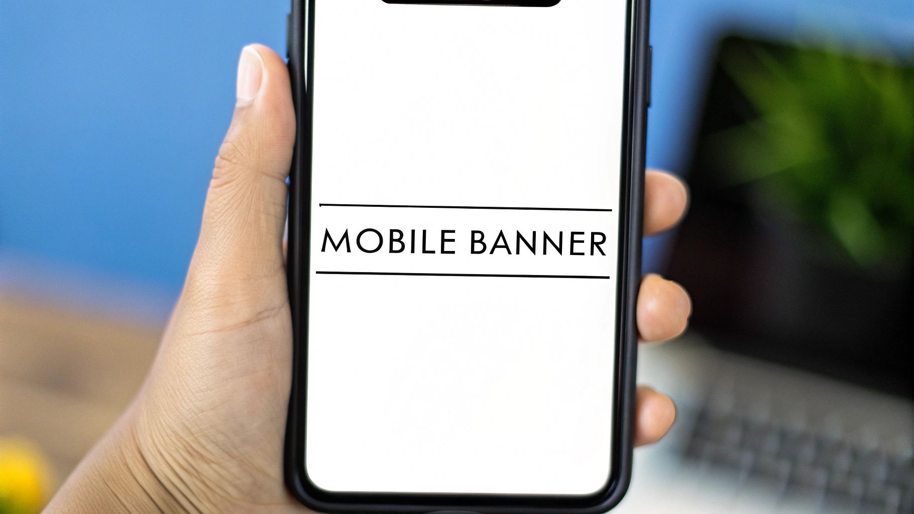
6. Mobile Banner (320×50 pixels)
The 320×50 Mobile Banner is the undisputed standard for advertising on the small screen. As internet traffic has shifted dramatically from desktop to mobile, this compact, horizontal format has become an essential component of nearly every digital campaign. It is typically anchored to the top or bottom of a mobile device's screen, offering persistent visibility without hijacking the user experience.
Popularized by mobile-first platforms and ad networks like Google's AdMob, the 320×50 banner is a primary monetization tool for countless app developers and mobile publishers. Its success stems from its ability to deliver a brand message effectively within the highly constrained real estate of a smartphone screen. News apps, mobile games, and social platforms frequently use this ad size to generate revenue while maintaining core functionality.
When to Use the Mobile Banner
This ad size is perfect for campaigns targeting on-the-go users and driving mobile-specific actions, such as app installs, mobile site visits, or click-to-call conversions. Its constant presence makes it excellent for building brand recall and delivering timely, location-based offers. Since it's one of the most common banner ad sizes, it provides massive inventory and reach across the mobile web and in-app ecosystems.
Actionable Design Tips for the 320×50 Mobile Banner
Designing for this compact space requires a "less is more" approach focused on instant clarity.
- Prioritize a Single Message: With limited space, focus on one clear value proposition. A simple brand logo, 3-4 words of benefit-driven text, and a compelling CTA are all you need.
- Maximize Font Readability: Use a bold, clean, and large font that is easily readable on a small screen. High contrast between text and background is non-negotiable for legibility.
- Keep File Size Minimal: Mobile users are often on slower connections. Ensure your ad's file size is extremely small (under 50kb is a good target) to guarantee fast loading times and avoid frustrating users.
- Design a Clear CTA: The call-to-action button must be visually distinct and large enough to be easily tapped with a thumb without causing accidental clicks on surrounding content.
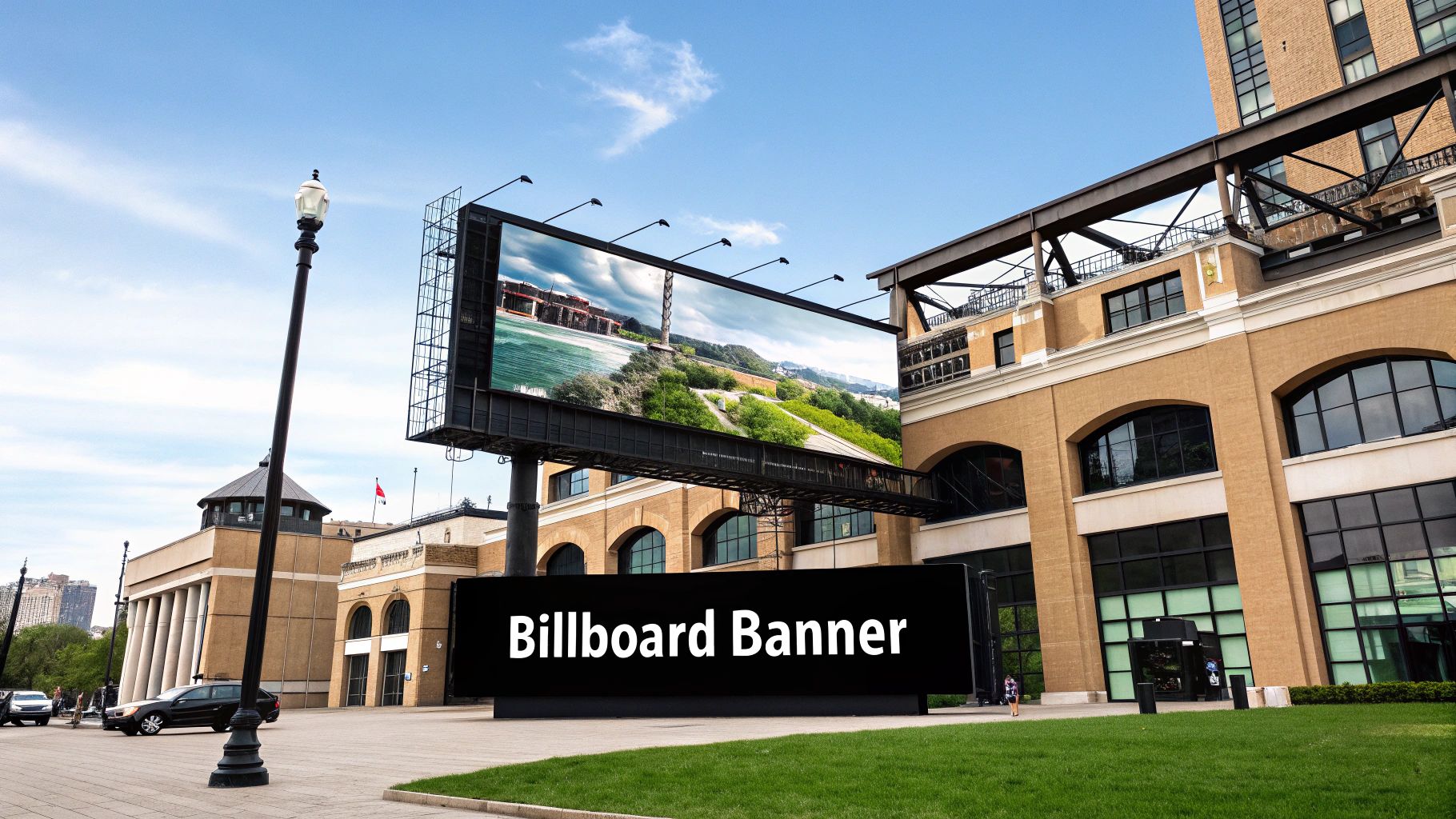
7. Billboard (970×250 pixels)
The 970×250 Billboard is a premium, high-impact ad unit often called a "Super Leaderboard." Its expansive dimensions allow it to dominate the top of a webpage, commanding immediate user attention upon arrival. This oversized format is typically placed "above the fold" and is reserved by major publishers like ESPN.com and The Financial Times for high-value campaigns that can leverage its large canvas.
Popularized by major brand launches and holiday season promotions, the Billboard’s value is its unparalleled capacity for visual storytelling. Unlike smaller common banner ad sizes, it provides enough space for rich imagery, detailed messaging, and even embedded video elements. This makes it a favorite for brands like Nike and Amazon looking to make a bold statement and capture market share.
When to Use the Billboard
This format is purpose-built for top-funnel marketing objectives like brand awareness, product launches, and major announcements. Its sheer size ensures your message is not just seen but experienced, creating a memorable impression. It is the perfect choice for campaigns where creative impact and brand presence are the primary goals, justifying its premium cost with high viewability and engagement potential. To grasp the potential of this large format, delve into successful examples by exploring some of the Top Billboard Ad Campaigns.
Actionable Design Tips for the 970×250 Billboard
To capitalize on the Billboard’s expansive real estate, your design must be both stunning and technically sound.
- Prioritize Visual Impact: Use high-resolution, premium creative assets. The large format will expose any imperfections, so invest in professional photography or graphics that reflect your brand’s quality.
- Optimize File Size Aggressively: A large banner can slow down page load times, harming user experience. Compress images and scripts without sacrificing quality. Aim for a file size under 150-200 KB to ensure it loads quickly.
- Use a Clear Visual Hierarchy: Guide the viewer’s eye from a captivating image to your core message and finally to a prominent call-to-action (CTA). The large space allows for more creative layouts than a standard banner.
- Integrate Rich Media: Consider using subtle HTML5 animations or even an embedded video preview to create a dynamic and engaging experience that stops users from scrolling. Learn more about best practices for the 970x250 ad size to refine your strategy.
8. Vertical Rectangle (240×400 pixels or 250×360 pixels)
The 240×400 Vertical Rectangle, and its close cousin the 250×360, is a highly effective ad unit that leverages vertical screen space. While not as wide as other common banner ad sizes, its taller aspect ratio provides a unique canvas that stands out, particularly in sidebar placements or integrated within mobile content feeds where vertical scrolling is the primary user action. This format is sometimes referred to as a "fat skyscraper" due to its dimensions.
Its rise in popularity is tied to the growth of mobile browsing and the adoption of responsive web design. The Vertical Rectangle fits neatly into grid-based layouts and is less disruptive than wider banners on smaller screens. Content discovery platforms and lifestyle publishers often use this size to blend sponsored content seamlessly alongside organic article recommendations, making it a valuable tool for native advertising efforts.
When to Use the Vertical Rectangle
This format is exceptionally well-suited for visual storytelling and showcasing products with vertical attributes. It's ideal for fashion and apparel ads that can display a full outfit, e-commerce ads featuring a product with a list of key benefits below it, or service promotions that use a step-by-step visual guide. The vertical orientation encourages a top-to-bottom reading flow, allowing for more complex or sequential messaging.
Actionable Design Tips for the 240×400 Vertical Rectangle
To maximize the impact of this unique format, focus on guiding the user's eye downward through a compelling narrative.
- Create a Visual Hierarchy: Place your most compelling visual or headline at the very top to capture attention instantly. Use the space below to build on that initial hook with supporting copy or additional product images.
- Leverage Vertical Storytelling: Use the height to your advantage. You can feature a person's image, a tall product like a bottle, or stack compelling benefit points vertically. Guide the user’s eye down towards the call-to-action.
- Keep the CTA Above the Fold (Where Possible): In many placements, the entire ad is visible at once. Ensure your call-to-action button is prominent and clearly positioned at the bottom, creating a natural conclusion to the ad's message.
- Ensure Fast Rendering: Because this ad is often placed within content feeds, a slow-loading creative can disrupt the user’s scrolling experience. Optimize image file sizes and keep animations lightweight to ensure the ad appears instantly.
9. Large Rectangle (336×280 pixels)
The 336×280 Large Rectangle is a high-performing and common banner ad size, often seen as an upsized alternative to the Medium Rectangle. Its slightly larger dimensions provide more creative real estate for richer visuals and more detailed messaging without significantly disrupting the user experience. This format is highly favored by performance-focused advertisers and is a top choice within the Google Display Network.
The value of the Large Rectangle comes from its versatility. It can be seamlessly integrated within article content (often referred to as an "in-content" ad) or placed in sidebars, where its generous size commands attention. E-commerce giants like Amazon and Home Depot frequently leverage this format for dynamic retargeting campaigns, showcasing previously viewed products with compelling clarity.
When to Use the Large Rectangle
This ad unit excels in campaigns where visual detail is critical, such as e-commerce, real estate, or automotive advertising. It is exceptionally effective for direct-response and conversion goals, as the extra space allows for more persuasive elements like pricing, ratings, or multiple product images. Use it when you need to provide more information than a smaller banner allows but want to maintain a compact, squarish footprint.
Actionable Design Tips for the 336×280 Large Rectangle
To harness the power of this visually dominant format, focus on making your product or offer the hero.
- Prioritize High-Quality Imagery: The larger canvas demands crisp, high-resolution product photography or graphics. A pixelated or poorly composed image will be immediately noticeable and undermine your campaign’s credibility.
- Showcase Clear Benefits and Pricing: Use the additional space to your advantage by including specific, tangible benefits or transparent pricing information. For example, add text like "Free Shipping" or display a star rating to build trust.
- Implement Subtle, Purposeful Animation: Animate key elements to guide the user's eye. A gentle zoom on a product image or a subtle pulse on the CTA button can effectively draw attention and encourage clicks without being distracting.
- Optimize for Fast Loading: Richer visuals can lead to larger file sizes. Compress your images and assets diligently to ensure the ad loads quickly, preventing users from scrolling past it before it fully renders.
10. Mobile Interstitial (600×500 pixels or full screen)
The Mobile Interstitial is a powerful, full-screen ad format that appears at natural transition points within a mobile app or website. Unlike standard banners that share screen real estate, interstitials command the user's complete attention by covering the entire interface between content, such as between game levels or news articles. This high-impact approach guarantees 100% viewability, making it a favorite for driving specific, high-value actions.
Popularized by mobile game developers and app monetization platforms like AppLovin, this format’s strength lies in its ability to deliver an immersive brand experience. While its intrusive nature requires careful implementation to avoid user frustration, its effectiveness is undeniable. It provides a large canvas for rich media, video, and interactive elements, turning a simple ad into an engaging mini-landing page directly within the user's journey.
When to Use the Mobile Interstitial
This format excels in campaigns where the primary goal is a direct conversion, such as an app install, a sign-up, or a specific in-app purchase. It is less suited for general brand awareness and more for performance-driven marketing. Use it when you have a compelling, high-value offer that can justify the temporary interruption of the user experience, like promoting a limited-time sale in a mobile commerce app or encouraging a download for a related application.
Actionable Design Tips for the Mobile Interstitial
To harness the power of this format without alienating users, your design must be strategic, respectful, and immediately valuable.
- Prioritize the Exit: The most critical element is a prominent and easily accessible close button (“X”). Hiding or delaying this option is a primary source of user frustration and can lead to app uninstalls and negative platform reviews.
- Time it Perfectly: Deploy interstitials only at logical breaks in the user flow. Showing an ad in the middle of a task is disruptive, but showing it after a task is completed (e.g., after a level is won) feels like a natural pause.
- Optimize for Speed: The interstitial must load almost instantly. A slow-loading ad creates a jarring user experience and increases the likelihood of an immediate dismissal. Compress images and streamline creative assets to ensure minimal load time.
- Limit Ad Frequency: Bombarding users with interstitials is the fastest way to drive them away. Implement a frequency cap to limit how often a single user sees this type of ad within a session or a day to maintain a positive experience.
Top 10 Banner Ad Sizes Comparison
From Pixels to Performance: Putting Your Banner Knowledge into Action
Navigating the landscape of digital advertising can feel complex, but as we've explored, a foundational understanding of the most common banner ad sizes transforms a campaign from a shot in the dark into a precision-targeted strategy. This guide has journeyed through the essential formats, from the classic desktop Leaderboard (728×90) to the high-impact Mobile Interstitial, providing a blueprint for creating visually compelling and effective advertisements. The core takeaway is simple: size is not just a technical specification; it is a critical component of your creative strategy.
Choosing the right dimensions is about matching your message to the user's context. A Wide Skyscraper (300×600) offers a large canvas for storytelling on a desktop sidebar, while a Mobile Banner (320×50) demands concise, high-contrast messaging for on-the-go viewing. Mastering these nuances is what separates forgettable ads from those that capture attention and drive conversions.
Synthesizing Your Strategy: Key Takeaways
To distill this comprehensive overview into actionable intelligence, let's recap the most vital principles. These are the concepts that will directly influence your campaign's return on investment and brand impact.
- The Power Trio: If your resources are limited, prioritize the Medium Rectangle (300×250), the Leaderboard (728×90), and the Wide Skyscraper (300×600). These three sizes offer the broadest inventory reach across the Google Display Network and other programmatic platforms, ensuring maximum visibility for your initial campaigns.
- Mobile-First is Non-Negotiable: With mobile traffic dominating the digital sphere, formats like the Mobile Banner (320×50) and larger, more immersive interstitial ads are essential. Always design with the smallest screen in mind, ensuring your call to action and value proposition are crystal clear, even at a glance.
- Context Dictates Creative: The effectiveness of a banner ad is inextricably linked to its placement. A Billboard (970×250) at the top of a homepage serves a different purpose than a subtle Large Rectangle (336×280) embedded within an article. Tailor your copy, imagery, and design hierarchy to align with the user's mindset in that specific digital location.
Moving from Theory to Tangible Results
With this knowledge in hand, the path forward is clear. Your next steps should involve a pragmatic and data-driven approach to implementing what you've learned. Don't let this guide become just another bookmarked article; use it as a launchpad for immediate action.
- Audit Your Current Assets: Review your existing ad creatives. Are you relying on just one or two sizes? Identify gaps in your asset library based on the top-performing formats discussed, particularly for mobile and high-impact placements.
- Prioritize and Test: You don't need to create every size at once. Select three to five key sizes that align with your target platforms and audience behavior. Launch an A/B test comparing a high-impact format like a Half Page (300×600) against a standard like the Medium Rectangle (300×250) to see what resonates.
- Streamline Your Workflow: The biggest bottleneck in testing and optimization is often the creative production process itself. Manually resizing and redesigning ads for every single dimension is time-consuming and inefficient. This is where modern tools become a game-changer, allowing you to focus on strategy instead of tedious tasks.
Ultimately, mastering the common banner ad sizes is about gaining a competitive edge. It’s about ensuring your brand shows up consistently, professionally, and effectively across the vast digital ecosystem. By moving beyond a one-size-fits-all approach, you empower your campaigns to achieve their full potential, delivering a stronger message, driving higher engagement, and generating a significantly better return on your advertising spend.
Ready to stop guessing and start generating? quickads.ai uses AI to instantly create perfectly sized and on-brand ad creatives for all the common banner ad sizes, eliminating hours of manual design work. Turn your newfound knowledge into high-performing campaigns in minutes by visiting quickads.ai to get started.


Privacy is important to us, so you have the option of disabling certain types of storage that may not be necessary for the basic functioning of the website. Blocking categories may impact your experience on the website. View Our Privacy Policy


