For growth and creative leads

How to Design Better-Performing Display and Social Ads

What separates ads people notice from ads people scroll past.

Most ad creative never gets a real look, and what does often gets decided on taste, not data. Design the two seconds that decide whether it's seen at all, then test it like every other variable that matters.

10 min readBy Quickads
The gist

Most ad creative fails in the first two seconds, before anyone reads a word of copy or knows who it's targeting. This guide covers what actually holds attention long enough to be remembered, why design usually skips the testing rigor copy and targeting get, and how to test it properly instead of deciding it once in a meeting.

Where ad creative stalls
01The ad loses before anyone reads a word
Roughly two and a half seconds of real attention decides whether an impression becomes a memory. Under that line, you paid for a scroll. Read this chapter
02Design gets treated like taste
Copy gets tested. Audiences get tested. The design gets settled in a meeting by whoever holds the strongest opinion, then runs for a quarter. Read this chapter
03Four variants, one idea underneath
Colour swaps and font changes are not variety. If every version asks the eye to do the same thing first, the test has nothing real to choose between. Read this chapter
04Everything in the frame is shouting
An offer, a badge, a lifestyle shot and a logo all competing for the same half second. When nothing wins the eye, nothing gets remembered. Read this chapter
01
Chapter 01 / The two-second problem

Most ads lose before anyone reads a word

The battle for an ad isn't won on the landing page, or even in the caption. It's won or lost in the fraction of a second before either of those things get a chance to matter.

Attention researchers describe a threshold: roughly 2.5 seconds of active attention before an ad has any real chance of forming a memory. Below it, an impression happens and nothing sticks. Above it, the odds start to shift. Independent research from attention-measurement firms and studies published through WARC puts the miss rate at around 85% of digital ads never reaching that threshold at all.

That's not a targeting problem or a budget problem. Copy can be sharp, the offer can be strong, the audience can be exactly right, and none of it gets read if the design itself doesn't hold the eye first. Design isn't decoration on top of a media plan. For the first two seconds, it's the entire media plan.

The threshold
2.5 sec
of active attention an ad typically needs before any memory of it forms
The miss rate
~85%
of digital ads never hold attention long enough to be remembered at all
The fix
1.5 sec
is enough when an ad carries one distinctive, repeated brand asset
Targeting decides who sees an ad. Design decides whether they actually see it.
02
Chapter 02 / The bottleneck

Design got treated like taste

Targeting gets tested. Copy gets tested. Bidding strategy gets tested, refined, and tested again. Then there's the design itself, the actual composition people are looking at, which in a lot of teams gets decided in a review meeting by whoever argues hardest, and then left alone for months.

That's not a discipline problem. It's a cost problem that just quietly went away.

A few years ago, testing five real design directions meant briefing five real executions, which meant it rarely happened. Now that generation is fast and cheap, design is finally affordable to treat like every other variable: something with a hypothesis, a test, and a result, instead of something decided once and defended forever.

This isn't an argument against craft. It's the opposite. When you can test ten directions instead of committing to your first one, craft is what separates the direction that wins from the nine that didn't.

Quick check

How much is riding on each variant?

Two numbers. One honest calculation, not a fabricated waste score. See how concentrated your spend actually is.

$10,000per variant tested

This is arithmetic, not a measurement of actual waste. What counts as "enough" testing depends on your category, price point, and how creative typically performs for it, so treat the read below as a prompt to check, not a verdict.

03
Chapter 03 / What breakthrough looks like

Five things breakthrough ads have in common

None of these are about being clever. They're about giving an eye scanning a feed at speed one clear reason to stop.

01

One focal point

A cluttered composition asks the eye to do triage in a frame it can't afford to spend on triage. Give it one thing to land on.

02

Contrast, not subtlety

The eye moves toward whatever's most different from what's around it, not toward whatever's prettiest. Make the difference obvious.

03

Legible at thumbnail size

If it doesn't read at roughly 400 pixels wide, the way it actually gets seen, no amount of detail at full size will save it.

04

One repeated asset

A color, shape, or character used the same way every time. It's what lets the 1.5-second version of attention still work.

05

Built to be tested

A design that can lose a test cleanly, and get replaced without a fight, beats one that's precious and never gets challenged.

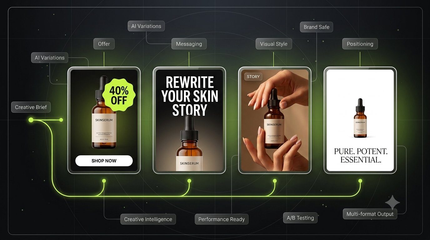
One brief, many compositions

Same product. Different tests.

The point isn't finding the one perfect layout. It's running enough real variety that the data can actually pick a winner.

One creative brief for a skincare serum branching into four tested directions: offer-led with a 40% off badge, story-led with a rewritten headline, lifestyle photography with hands, and a minimal positioning-led layout, all feeding into the same AI variation and testing pipeline
04
Chapter 04 / What testing teams do

What the testing teams do differently

The gap between teams whose design keeps improving and teams whose design just sits there usually comes down to where the decision actually gets made.

Where the decision happensThe old wayThe tested way
Choosing a directionWhoever argues hardest in the reviewSeveral real directions, generated and put in front of an actual audience
Judging what worksInternal taste, decided onceClick and conversion data from the test itself
Updating a designA new round of briefs and a week of waitingA new variant in minutes, from the same locked brand setup

Most of this comes down to one thing: a brand setup that's locked once and reused every time a new direction gets tested. See how Quickads keeps design on-brand while testing at volume →

05
Chapter 05 / Cluttered vs. clear

Same product, one focal point

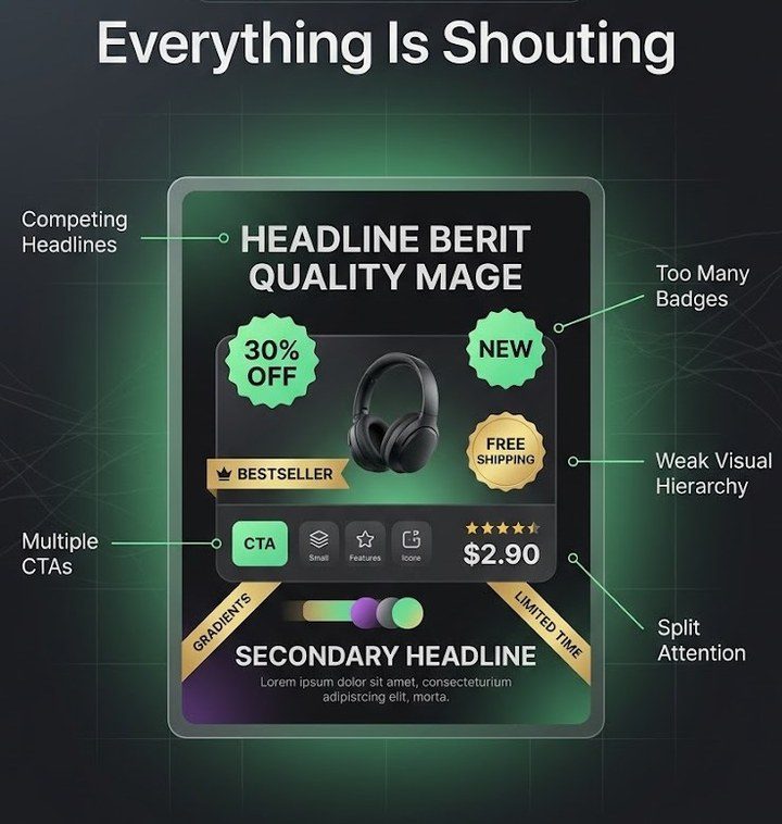
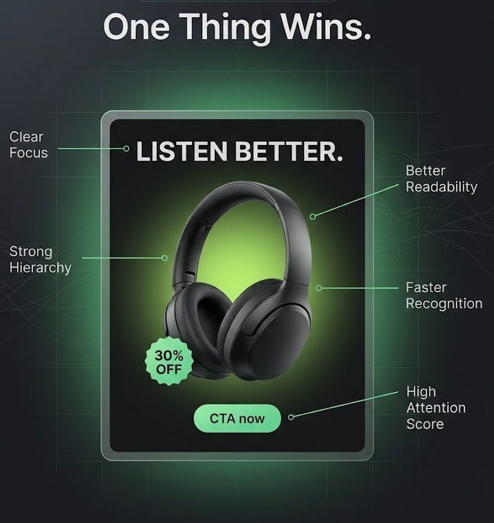
Principle 01 from the last chapter, shown rather than told. Nothing here changed except what the composition asks the eye to do first.

Competing for attention
Annotated headphones ad titled Everything Is Shouting, showing the problems: competing headlines, too many badges, a weak visual hierarchy, multiple calls to action, and split attention

Four messages, three badges, one product. The eye doesn't know where to land, so on a fast scroll it mostly doesn't.

One clear read
Annotated headphones ad titled One Thing Wins, showing clear focus, strong visual hierarchy, better readability, faster brand recognition, and a high attention score

One product, one message, generous negative space. It reads in the time a thumb takes to flick past it.

Curious how your own layout stacks up against what's already winning in your category? Browse the 30M+ ad reference library →

From brands using it

What testing more designs actually does

Udemy
What stood out was the speed and precision. The team understood our tone and our learner audience, and built creatives that actually convert across Meta, Google, and influencer channels. In a crowded edtech market, that makes a measurable difference.
Ramji SundararajanPresident, Udemy
3.5×
Increase in ad conversion rate
68%
Reduction in creative turnaround
2.8×
Growth in influencer campaign reach
C. Krishniah Chetty & Co.
Quickads helped us translate 150 years of craftsmanship into creative that actually performs on Meta and Google. What used to take weeks of shoots, edits, and approvals now ships in days, on-brand and built for every format, without losing the soul of the brand.
Vidya NatarajDirector, C. Krishniah Chetty & Co.
Faster creative production
190%
Increase in client retainer renewals
2.3×
Higher campaign engagement
06
Chapter 06 / Score your testing

How rigorously are you testing your design?

Four quick questions. This isn't a verdict on your taste, it's a look at whether design gets the same testing discipline as everything else in the media plan.

41
out of 100 · Testing
Lagging
Testing
Compounding
04070100
Design variants tested per concept
How a direction gets chosen
A repeated, distinctive asset
Checked at feed thumbnail size
Inside Quickads

One brand system. Every format.

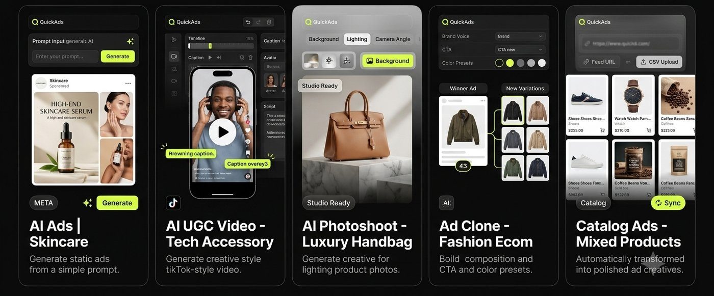
The same locked brand setup, the logo, colors, fonts, and product shots, feeds every direction you test, so speed never costs you consistency.

This is what actually lets a growing team test design at volume without the brand drifting. A few things stay fixed on purpose, logo usage, color values, type, so nobody has to re-approve them for the hundredth variant. Everything else, the composition, the message, the format, stays open to test. Growth teams, brand teams, and outside agency partners can all build from that same locked base instead of re-briefing it every time.

Locked
Logo, palette, and type stay fixed, so nobody re-approves the basics on variant 47
Open
Composition, message, and format stay free to test, every time, on purpose
Shared
Growth, brand, and agency partners all build from the same base, not five versions of it
Five Quickads product panels from the same brand system: AI static ads generated from a prompt for a skincare serum, an AI UGC-style TikTok video for a tech accessory, an AI product photoshoot for a luxury handbag, an ad clone tool applying a winning composition and color presets to new fashion products, and catalog ads auto-generated across a mixed product feed
07
Chapter 07 / The habits

The habits that make it work

None of this requires a bigger team. It requires treating design like a variable, on purpose, every week.

01

Generate more than one direction

Before anyone gets attached to a favorite, put two or three genuinely different compositions on the table.

02

Let the data kill your favorite

If the direction you liked least wins the test, ship the winner. That's the point of testing at all.

03

Check it at actual size

Preview every design at roughly feed thumbnail width before it ships, not just at full screen in a deck.

04

Repeat one asset on purpose

Pick a color, shape, or character and use it the same way in every variant, so recognition compounds instead of resetting.

05

Let performance write the next brief

Feed results back to whoever's designing, so the next round starts from what actually worked.

06

Refresh before fatigue, not after

Watch for rising frequency and softening CTR, and ship a fresh variant ahead of the dip.

Before you ship

The pre-flight checklist

Four checks, under a minute, before any variant goes live. Nothing here needs a platform's algorithm to confirm it, just the five principles from Chapter 03 and your own eyes.

0 of 4 checked
Check a few boxes above to see a read on where this composition stands.

Running this checklist across ten variants a week, not one, is what testing at volume actually looks like. See how Quickads generates and tests them →

Chapter 08 / Where the numbers come from

Where these numbers come from

Two figures in this guide are Quickads' own, sourced from our current platform data. The attention-research figures in Chapter 01 are external, from attention-measurement research published through WARC, cited here as context, not as a Quickads claim.

Every figure is a directional benchmark, not a promise. Test them against your own audience and platform before you rely on them.

30,000+
brands building creative with Quickads
30M+
ads in the Quickads reference library
FAQ

The questions we actually get

Straight answers, no pitch.

What actually makes an ad design work?
One focal point, real contrast against whatever it's competing with, legibility at the size it's actually seen, and a distinctive asset repeated often enough that people recognize it before they consciously register the brand name. Everything else is secondary to those four.
How many design variants should I test per concept?
Enough that a real winner can emerge, usually three or four genuinely different compositions rather than minor color swaps. One variant tested against nothing isn't a test, it's a guess with extra steps.
Does good ad design help a brand show up in AI search?
Indirectly, yes. Answer engines tend to favor brands with a consistent, distinctive identity and information only they can produce. A repeated visual asset used deliberately across every ad is exactly that kind of signal. A generic composition that looks like everyone else's gives an AI system, and a person, nothing to hold onto.
Do I need a professional designer, or can AI generate this?
AI is genuinely good at producing real variety fast, which is what testing needs. Judgment on which direction is actually working, and why, still benefits from someone who understands design. The two pair well: AI for range and speed, a person for the call.
How is testing design different from testing copy or audience?
Same discipline, different variable. Change one thing at a time, so if you're testing composition, hold the copy, audience, and placement steady. Most teams have a mature process for copy and audience tests already. Design is usually the one still decided in a meeting instead of a test.
How do you test ad design at scale without the brand drifting?
Fix the few things that define recognition, logo usage, color values, type, so they never need re-approving. Leave everything else, composition, message, format, open to test. A growth team, a brand team, and an outside agency can all build from that same locked base without quietly turning it into five different brands.

You've got the speed. Now lock down the system

Testing faster only pays off if the brand holds together while you do it. Quickads locks the logo, palette, and type, so every variant you test still looks like you, whether that's one team or ten.